PowerPoint vs Keynote: Which Is The Best Presentation Software?
The PowerPoint vs Keynote debate has been around for ages. While most people will say PowerPoint is the best presentation software ever, Mac users may beg to disagree. In this article, I’ll do my best to provide as neutral a take as possible, so you can choose the best presentation software for your needs.

PowerPoint vs Keynote: What’s similar?
If you’ve been tasked to present something in front of an audience, you’d usually use a presentation software (or app, as it’s called nowadays). This can be PowerPoint, Keynote or whatever presentation app you have access to.
You wouldn’t normally use a word processor like Microsoft Word or Apple’s Pages app. Of course, if you’re pressed for time, and you absolutely must present at that very moment, you can just show people whatever you have on your screen. However, if points are awarded to properly made presentations, then using PowerPoint or Keynote is the way to go.
There are many advantages to using either PowerPoint or Keynote for your presentations. For instance, both of them are slide-based. You can control the flow of your presentation by adding as little or as many points for discussion on your slide. Ideally though, only discuss one point per slide. You can also pick from several types of content (including graphics and multimedia) to add to your slides.
To keep your audience hooked, you can also use a variety of transitions and animations. But keep these to a minimum as people can easily get motion sick when there are far too many fancy schmancy animations! When used correctly, however, the right combination of content and animation can create a memorable experience for your audience.
These are just a few of the similarities between these two popular presentation apps. Read along to find out when you should use one app over the other.
When to use PowerPoint over Keynote?
PowerPoint is so ubiquitous that it’s easy to think everyone’s probably heard of or used it at one time or another. From academic to business or corporate presentations, PowerPoint has been the de facto presentation software for decades. In fact, for many people, the word ‘PowerPoint’ is synonymous with ‘presentations.’
That being said, if you’re not yet firmly in the PowerPoint camp or are looking for validation to stay in it, here are some good reasons for you:
- You’re a PC user and PowerPoint is already installed on your system
A PowerPoint license can cost you a pretty penny. So, if it already came pre-installed on your computer, then there’s no need to go look for another presentation app. Chances are you’ve used PowerPoint or other Microsoft Office apps before. So, you’ll be familiar with how their ribbon menu system works.
The ribbon works practically the same way across MS Office apps. Even if you’ve only used Word or Excel before, you’ll still feel right at home with the PowerPoint interface. When you have easy access to PowerPoint, you can just fire it up anytime and work on your presentation when you need to.
- Everyone on your team is using PowerPoint
If you’re collaborating with other PowerPoint users, it wouldn’t make sense to ask them to use Keynote. Common sense would dictate that you use PowerPoint as well so you can quickly work on tasks assigned to you.
You’re probably wondering why that would be a problem when Apple themselves have announced that they’ve improved Keynote’s compatibility with PowerPoint. Well, it’s true that you can now open PPT files on Keynote and export keynote files to PowerPoint.
However, do you really want to jump through several hoops just to get the files converted or exported to the right format? Would you actually prefer to do something that will take you 10 clicks (on Keynote) as opposed to just a single click (on PowerPoint)? If you’re working under time pressure, it makes sense to just use the app that everyone else is using.
- You want to use that beautiful PowerPoint template you found online
The global PowerPoint community is massive. There are plenty of designers who spend their free time creating PowerPoint templates. They know there’s a demand for it and they work hard to fulfill that demand.
Templates are awesome in that they are literally time- and life-savers. Instead of spending 10 hours working on your slides, you can edit an existing template and have your slides finished in under an hour!
If you didn’t already know, 24Slides also has our very own Template Hub which you can check out right here. All our templates are 100% free and have been professionally-designed by our in-house team of presentation designers. Here’s a screenshot of one of our most popular templates:
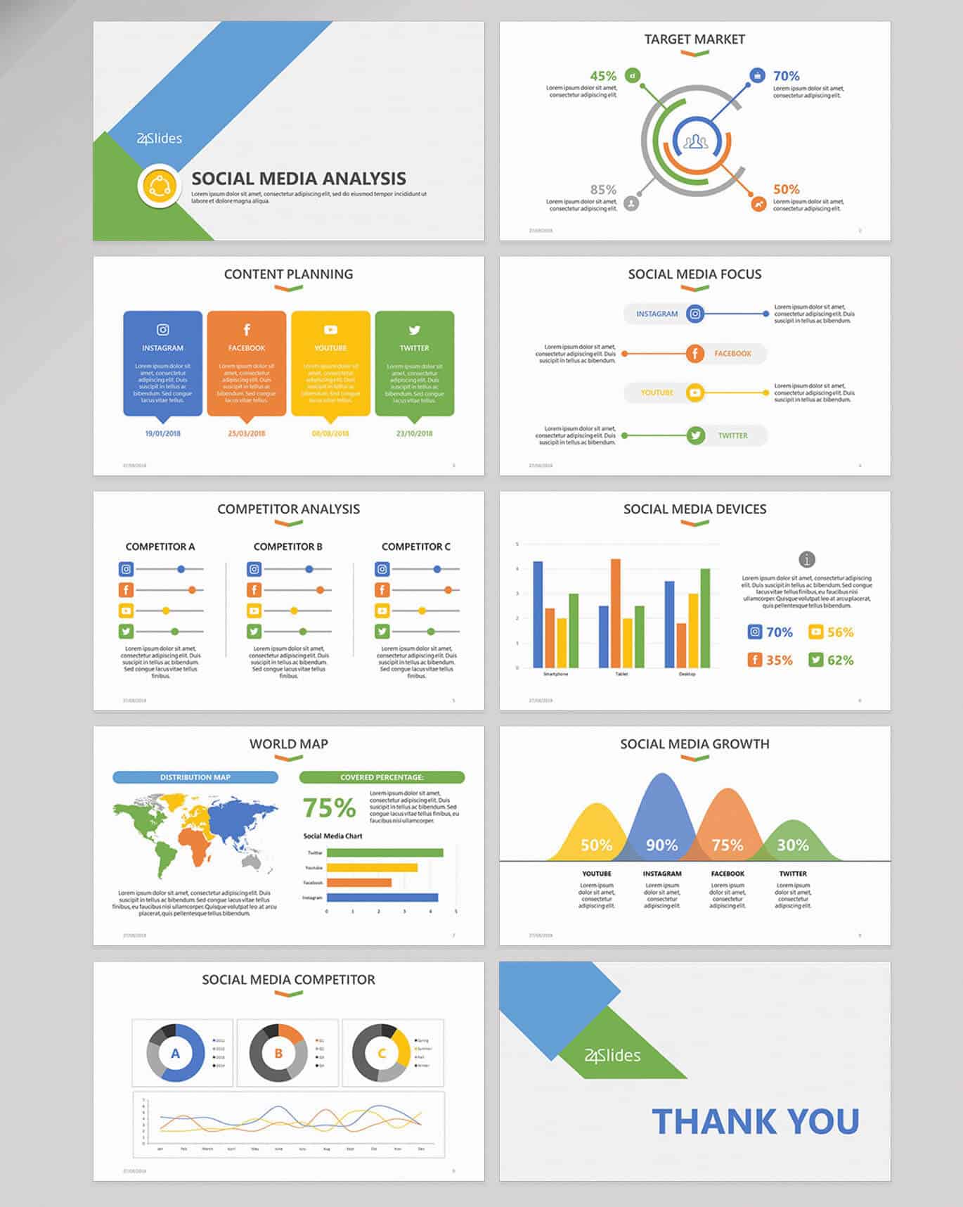
In short, there are a ton of options available for PowerPoint users. So, if you want a wealth of options for your presentations, then PowerPoint is the right app for you.
- Advanced features you’re not going to find anywhere else
In addition to being a powerful presentation software, did you know PowerPoint is also a stand-alone graphics app? Yes, it is. Well, it’s nowhere as advanced as Photoshop, but for basic graphics creation, PPT can handle it with aplomb. You can remove backgrounds in images, you can crop and reshape pictures, you can even create social media graphics!
You can also convert your PowerPoint file into video format. If you’re looking to share your presentation online, just convert it to video and upload to your YouTube channel! If you want to host a webinar, you can also use PowerPoint to create your slides and share it with your audience.
The new PowerPoint Designer is another very useful feature. You can simply add an element to your slide and PowerPoint will suggest a bunch of design ideas. Unfortunately, if you don’t see the Design Ideas button when you go to Design tab, then you probably need to purchase an Office 365 subscription.
Check out PowerPoint’s ribbon menu and toolbar system. This is where all the magic happens:

Some may say PowerPoint’s menu option is far too complicated. It takes some getting used to, but once you become familiar with how it all works, you’ll see it’s not really all that complicated. In fact, you may even find other presentation apps a bit lacking in the features department.
PowerPoint is like a jack of all trades in the presentation world. There are things you can do on PowerPoint that just isn’t possible on other apps. Some may say these extra – and more advanced – features aren’t necessary. But from my point of view, it adds a lot of value to the whole PowerPoint experience. If you want to learn how to make the most of PowerPoint, check out our tutorial articles here.
When to use Keynote over PowerPoint?
Keynote presentations are, arguably, better looking than PowerPoint presentations. Just like most Apple products, the aesthetics and polish of a Keynote presentation is second to none. But is this good enough reason to use Keynote? If you’re not sure whether you should make the switch, here are some compelling reasons for choosing Keynote over PowerPoint.
1. You’re an Apple user
If you’re deeply integrated within the Apple ecosystem, that is, you use MacOS or iOS in your day-to-day life, then Keynote is probably the right option for you. Apple’s Continuity feature is well-loved by Apple users for a reason.
Let’s say, you started working on your Keynote presentation on your Mac. But then you had to go somewhere. While you’re on the train or drinking coffee at Starbucks, you can use your iPad or your iPhone to pick up where you left off on your Keynote. Then when you get home, you can finish your Keynote on your Mac and get it ready for prime time!
Also, Keynote comes free on all Apple devices. So, you don’t need to shell out money to start using this amazing software. In case you’re wondering, PowerPoint for Mac is available, but it’s not free.
On top of it all, Apple regularly updates Keynote too. In fact, Keynote 9.0 was released just a few weeks ago (for free, mind you). So, you’re getting a frequently updated app for free. While PowerPoint users are stuck with either paying a subscription (to get regular updates) or buying Microsoft Office for a one-time fee (with no updates). So, this is a definitely a plus point for Keynote!
2. You want a user-friendly presentation software
PowerPoint is powerful, yes, but for novice users, it can be very overwhelming. To be fair, though, if you’re coming from PowerPoint and you’re trying out Keynote for the first time, you may find it confusing as well. Let’s just say that both apps have a learning curve, with PowerPoint’s considerably steeper thanks to its impressive feature list.
If you’re not interested in tweaking every single aspect of your slides, that is, you just want a presentation that looks good, then Keynote may be right for you. Keynote is said to be more intuitive and more user-friendly than PowerPoint, and I have to say, I agree with this assessment. There are fewer hoops you need to go through on Keynote to create a visually stunning presentation.
Keynote’s toolbar is considerably less busy and less cluttered than PowerPoint:

You can play around with the options on the toolbar, and you’ll see it’s not nearly as complicated as PowerPoint. Since you don’t have all the bells and whistles that PowerPoint has, you can quickly get the job done. In short, you can focus on what’s truly necessary.
You don’t need to choose from a million different things which will only confuse you and delay your final output. At the end of the day, you want a presentation that will help convey your message to your audience. And with that said, Keynote is more than capable of helping you out with your presentation needs.
3. Better looking themes from the get-go
It’s so much easier to identify presentations that are made with PowerPoint over those that are made on Keynote. Why? Because most PowerPoint users stick to the default options. They use the default Calibri font, use the default layouts, they even use the built-in outdated templates and themes that have been used in countless presentations.
Now, there’s nothing wrong with using the defaults per se. However, if you’re looking to stand out and make your presentation interesting and memorable, then you’re really not doing yourself any favors. This is where Keynote stands out.
Keynote’s default options look way better than PowerPoint’s. It’s really no contest, in my opinion. Keynote’s built-in themes are beautiful. Don’t believe me? Here’s a screenshot of Keynote’s Theme Chooser:
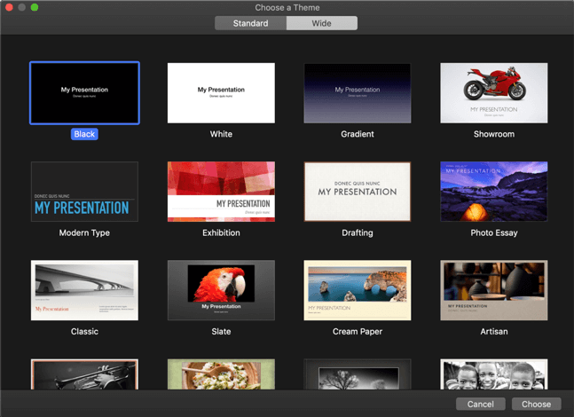
Wouldn’t you say the above looks way better than PowerPoint’s (see below)?
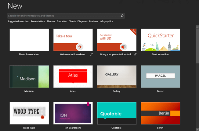
You can certainly make gorgeous presentations in PowerPoint, but you’d have to either use third-party templates or design one from scratch. Either way, it will cost you a bit of time. But with Keynote, you just need to select the theme you want to use, switch up the placeholders, and you’d have your attention-grabbing slides in mere minutes!
PowerPoint vs Keynote: A Head-to-Head Comparison of Key Features
As I’ve mentioned earlier in this article, PowerPoint has a lot of features that aren’t found in Keynote (or other presentation apps). So, in this section, we’ll compare apples to apples (pun intended) and evaluate these 2 apps based on some similar, key features.
· Formatting options
PowerPoint: To format an element in PowerPoint, you’d first need to click on it and a new tab will appear on the ribbon. If you want to edit text or images, click it and the Drawing Tools tab will appear. For tables and charts, it will be Table Tools and Chart Tools, respectively. Clicking on a picture will make the Picture Tools tab appear, like this:

Some of these Tools have more than just a Format menu, some also have an additional Design menu. A good example of this would be SmartArt Tools, Table Tools, and Chart Tools.
All these hidden menus give you a lot of control over an element’s format and design. You can literally make an element a 100% unique just by experimenting with the multitude of options at your fingertips!
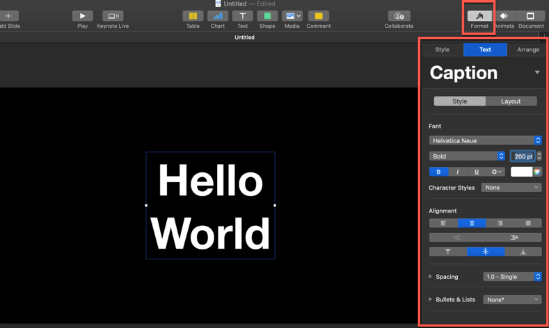
Keynote: Just like PowerPoint, you’d need to click on the element you want to edit so you can format it properly. For instance, if you want to format your text, you’d need to click on the text itself. Then hit the Format button on the upper right side; a sidebar will appear right below it.
For text formatting, Keynote will give you 3 tabs of options: Style, Text, Arrange. In the Style tab, you can adjust the fill, border, shadow, reflection and opacity settings. In the Text tab, you can change the font face, font size, alignment, spacing, etc. Under the Arrange tab, you can adjust the alignment, size, position, rotation, etc. of the text. Here’s a screenshot:
For table formatting, you’ll find the following tabs in the Format inspector sidebar: Table, Cell, Text, and Arrange. For chart formatting, these are the available options: Chart, Axis, Series, Arrange.
As you can see, there’s a similarity between the formatting options in both PowerPoint and Keynote. First, you’ll need to click on the element you want to edit, and the software will give you a bunch of formatting options to choose from. Second, make the adjustments you want to make and voila! You’ll have your newly formatted element!
My verdict: PowerPoint wins this round because it has a lot more formatting and design options available than Keynote. You have absolute control over the tiniest little thing on PowerPoint.
· Working with shapes
PowerPoint: Inserting shapes in your PowerPoint slide is easy. Just go to Insert > Shapes and click on the shape you want to use. Your mouse pointer will change to a precision pointer and you can now draw your shape anywhere on your slide.
If you want to draw a perfect shape, that is, you want it to maintain its exact dimensions, then you need to press the Shift key while drawing the shape. This is especially useful when drawing circles in PowerPoint.
If you want to create unique, fun shapes, you can easily do so in PowerPoint. First, you’ll need to click on the shapes you want to use – you can either use the Shift key or the CTRL key to select multiple shapes. Then in the Drawing Tools tab, click on the Merge Shapes button. As you can see below, you’ve got 5 different options: hover, combine, fragment, intersect, and subtract.
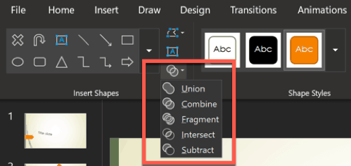
Hover your mouse over each of these options and you’ll see a quick preview of the resulting shape on your slide. If you want to use a particular effect, click on it and PowerPoint will apply the changes.
Keynote: Keynote’s Shape tab works a bit differently than PowerPoint. In PowerPoint, shapes and icons are two different buttons on the ribbon. But in Keynote, you’ll find both shapes and icons in the Shapes menu.
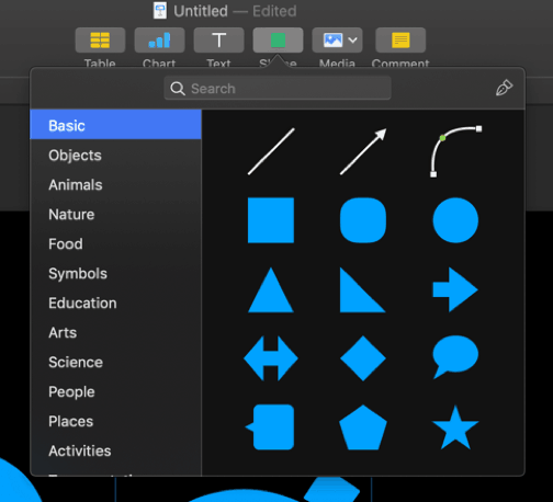
To insert a shape (or icon), click on it and it will appear in the middle of the slide. Unlike PowerPoint, you don’t get to decide where the shape is going to appear and what size. So, you need to click on the newly-added shape, resize it and drag it to where you want it to appear. But just like in PowerPoint, if you want to resize the shape perfectly, you will need to press the Shift key on your keyboard while resizing the shape.
If you’re wondering if you can also merge shapes in Keynote, the answer is yes. Select the shapes you want to merge, then click on Format > Shapes and Lines. You’ve got 4 options as you can see below: unite, intersect, subtract, and exclude shapes.
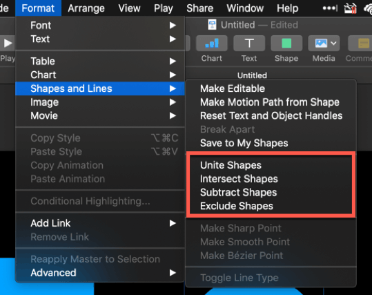
Unfortunately, Keynote doesn’t give you a preview of the merged shape by hovering over the options just like in PowerPoint. You’d need to click on the merge option to see the effect. If you don’t like the result, just hit command + z to undo.
My verdict: PowerPoint still wins this round with the number of shapes available and the different shape formatting options. Keynote basically only has 15 shapes (shown in the Basic tab) and the rest are vector icons.
· Editing the slide master
PowerPoint: PowerPoint’s slide master truly lives up to its name. Why? Because editing the slide master will allow you to make global changes to your entire presentation file.
To do this, just go to View > Slide Master. On the left side of the screen (navigation pane), you’ll see the slide master at the very top and the layout slides right below it.
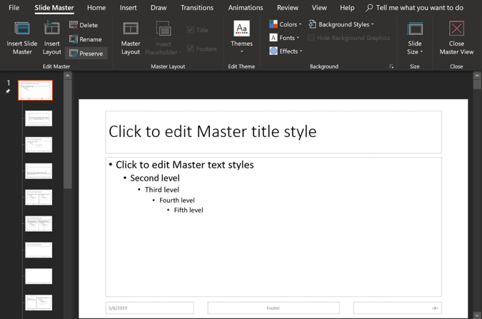
All changes you make to the slide master will be applied to all slides in your presentation. However, if you only make changes to a layout, then those will only appear every time you use that layout in your presentation.
If you want to add a new layout or even a new master slide, you can do so with just a single click. You can insert placeholders in the layout slides. Placeholders include text, pictures, charts, tables, SmartArt, media, and online image. You can even create a new theme color and format the background for all your slides in one fell swoop.
Keynote: You can also edit Keynote’s slide master, but it’s not nearly as feature-packed as PowerPoint’s. Yes, you can make changes to several slides by editing the layout/master slide it uses. But there’s no way to make global changes like you would with PowerPoint.
First, let me show you how you can edit Keynote’s master slide. Go to View > Edit Master Slides.
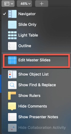
This is the Master Slides view. You can see all the layouts on the left side of the screen.
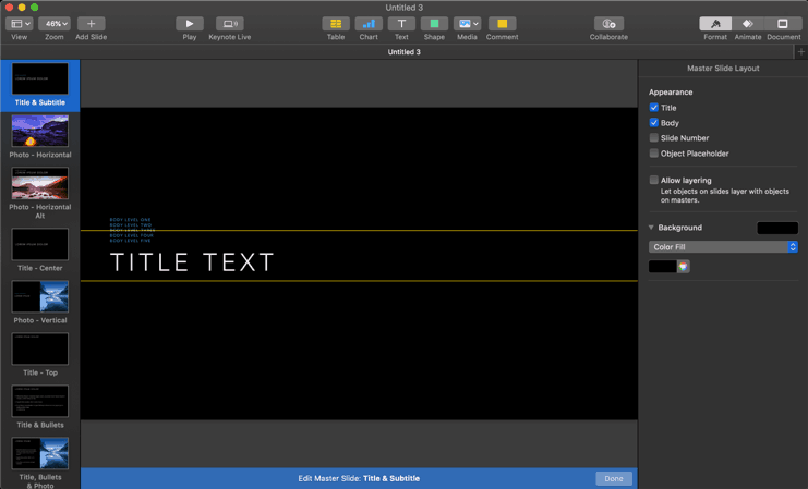
As you can see above, these are all the available layouts in a Keynote theme. There is no ‘master slide’ like you see in PowerPoint. If you make changes to a layout, that is, add or remove some elements, then it’s only going to affect the slides using that particular layout. There’s no way to make ‘global’ changes to your Keynote file.
For instance, if you want to add your logo to all your slides, you would need to add it manually. You can do this by editing the slides one by one, or by adding the logo to all the master layouts. Alternatively, you can also add the logo to a new layout and use this layout on all your Keynote slides.
Adding placeholders in Keynote works a bit differently from PowerPoint. There’s no Insert Placeholder button, but you can add elements to a layout slide and then define it as a Placeholder. You’ll find this option in Format inspector > Style. Here’s a screenshot:
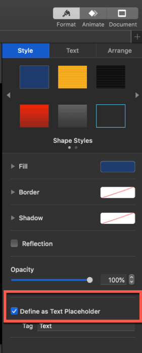
Make sure you tick the box like you see in the screenshot above. Otherwise, Keynote won’t recognize it as placeholder element.
My verdict: For this round, PowerPoint is the winner, no doubt about it. The ability to make universal changes just by editing the slide master is an absolute necessity. This is especially important when dealing with a large number of slides in your presentation.
· Animations and transitions
PowerPoint: Object animations and slide transitions can make your presentation look a lot more exciting. In PowerPoint, you can access the slide transition effects by clicking on the Transitions tab. You can specify effect options, duration, timing, etc.

For animations, you can click on the Animations tab. But in order to actually apply an animation to an element or object, you’d need to click on the element first. Then the animation options become clickable, like you see below:

There are 4 different kinds of animations: Entrance, Emphasis, Exit and Motion Path animations. Now, it’s easy to get carried away and apply animations to every single element on your slides, but please stop yourself from doing so! You don’t want people to vomit during your presentation. Yes, motion sickness can happen during presentations. So, please use animations only when they add value to your presentation.
Keynote: To access the different transition options in Keynote, click anywhere outside the slide. Then go to the Animate inspector and you’ll see the Transitions menu in the right sidebar. Click on Add an Effect to see the different transition options for your slide:
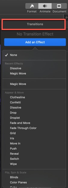
To animate various elements on your slide, you’ll need to click on the element first. Then when you go to the Animate inspector, you’ll see a bunch of different options. Instead of the Transitions tab, you’ll see the following: Build In, Action, and Build Out. These are equivalent to PowerPoint’s entrance, emphasis and exit animation effects.
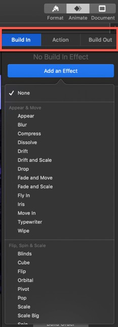
When it comes to the quality of animations and transitions, I have to say Keynote’s look way better than PowerPoint. You can preview the animations by hovering over the dropdown list and clicking on the Preview button that appears.
My verdict: For this round, Keynote is the winner. Their animations are way classier than PowerPoint’s and provides a much better viewing experience for your audience.
· Save and export options
PowerPoint: PowerPoint allows you to save your presentation in many different file formats. You’re not limited to saving your file in the default .PPTX format. You’ve got plenty of choices! Check out this screenshot:

When it comes to exporting your PPT, you’ve also got a lot of options. You can export it to PDF/XPS, video, CD package, handouts, and even publish it to Microsoft Stream. See here:
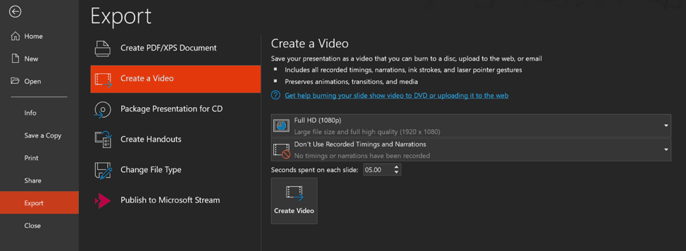
Keynote: When you save your Keynote file, you can only save it to one format. That’s the default .keynote file type. Your export options are pretty limited as well. However, it’s nice to be able to import keynote files to PowerPoint. You can convert to either .PPTX or .PPT format (PowerPoint 1997-2003 compatible).
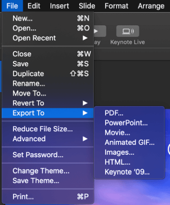
My verdict: While PowerPoint is obviously the winner due to the sheer number of file types you can convert your PPT to, I have to give credit to Keynote for at least being able to open PPT files. This is something that PowerPoint can’t do (open Keynote files). But obviously, it’s not Microsoft’s fault if Apple chooses to lock Keynote within the Apple ecosystem.
Final Words
The PowerPoint vs Keynote debate is probably going to continue into the foreseeable future. While I personally think PowerPoint trumps Keynote in so many ways, Keynote is still a powerful presentation software in its own right. Keynote is obviously an app that’s made exclusively for Apple users. But even so, it’s not for all Apple users. For those who want absolute creative control over their presentation slides, PowerPoint is the way to go.
Mac users who want more than what Keynote can give them can always buy their copy of PowerPoint for Mac. The downside to the Mac version is that it’s not full-featured like its Windows counterpart. So, you may need to look into installing Bootcamp so you can run Windows natively, or run a virtual machine app on your Mac.


