How to Make a Pie Chart in Google Slides: Step-by-Step Guide
Want to make your data more engaging? Pie charts are a great way to visualize information and show proportions at a glance. In this guide, you'll learn how to make a pie chart in Google Slides, ensuring your presentation stands out!
Whether you’re preparing a presentation for work, school, or personal use, this tutorial covers everything—from adding a pie chart to customizing it to suit your style. By the end, you'll have a polished pie chart to impress your audience.
Let’s get started and bring your data to life!

Here are the topics we'll cover:
- What is a Pie Chart?
- How to Make a Pie Chart on Google Slides
- How to Edit a Pie Chart in Google Slides
- Google Slides Pie Chart FAQs
- Looking for presentations that wow? 24Slides is your solution!
What is a Pie Chart?
A pie chart is a circular graph divided into slices, where each slice represents a part of the whole. The total of all slices adds up to 100%, representing the entire dataset.
Typically labeled with percentages, pie charts provide a clear way to grasp data at a glance. They are especially useful for showing proportions, making it easy to identify the largest and smallest values.
Imagine you’re a consulting firm that gathers client feedback to evaluate the effectiveness of your services. A pie chart can clearly display the distribution of feedback categories, helping you identify areas needing improvement.
Here’s an example:
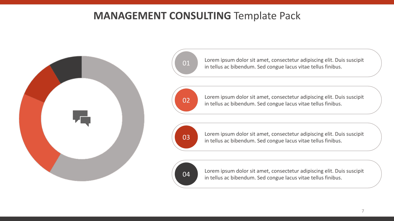
Tip: To make the most of your pie chart, limit it to six or fewer sections. This keeps the visualization clear, avoiding confusion.
How to Make a Pie Chart on Google Slides
Step 1: Open Google Slides
- Launch Google Slides and start a new or existing presentation.
Step 2: Create a New Slide
- Select or create a slide for the pie chart.
- To create a new slide, go to Slide > New Slide.
- For a clean layout, right-click on the slide and choose Apply Layout > Blank (optional).
Tip: You can also add a new slide by clicking the “+” icon in the menu or using the shortcut Ctrl + M.
Step 3: Insert the Pie Chart
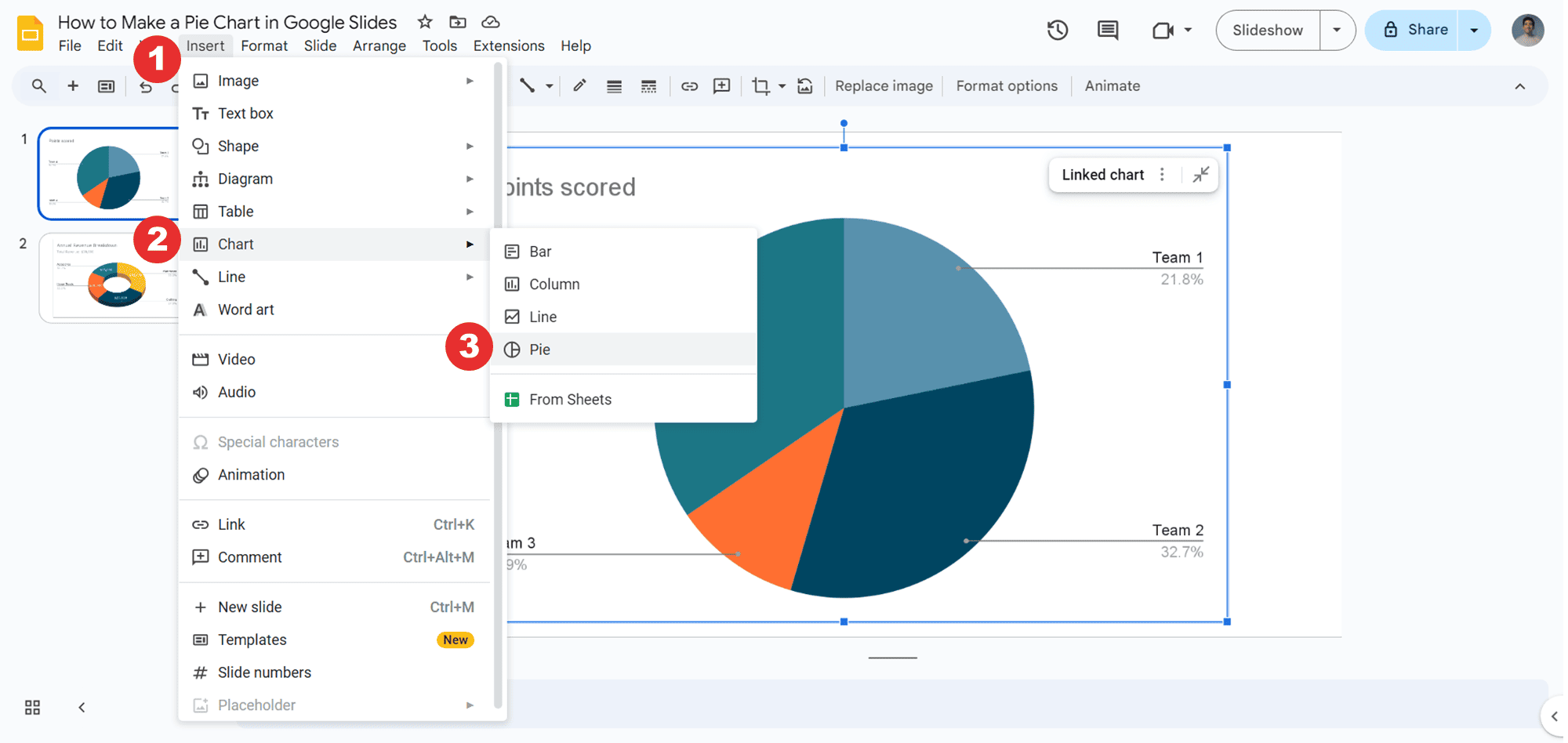
- Go to Insert > Chart. Then, choose the Pie Chart option.
Step 4: Enter your data
- Click the pie chart to select it. Then, click the three dots in the corner and select Open Source. This will open a linked Google Sheets document with default data.
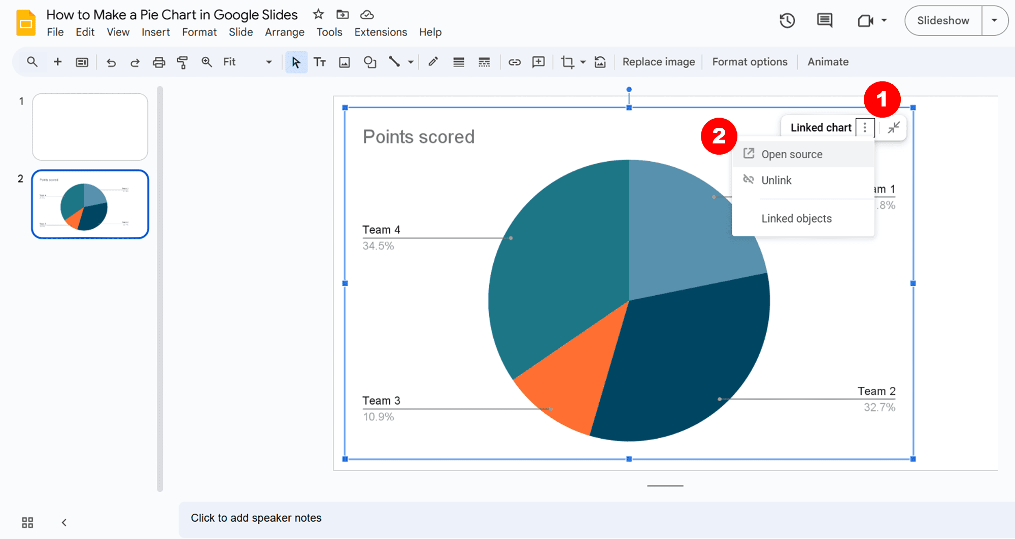
- Replace the default data with your own. Input your categories in the first column and the values in the second column. After editing your data, click Update to refresh the pie chart in Google Slides.
Step 5: Customize your pie chart
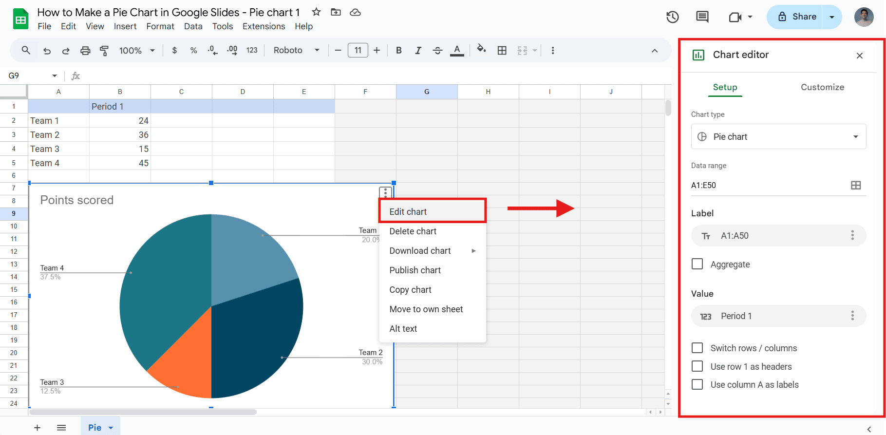
- In the Google Sheets document, click the pie chart to select it. Then, click the three dots in the corner and choose Edit Chart. This will open the chart editor.
Here, you can customize chart elements, modify styles and colors, and add data labels.
- To make small visual changes unrelated to the data, select your pie chart and click Format Options at the toolbar in Google Slides.
Here, you will find additional options to adjust the style and design to match your presentation.
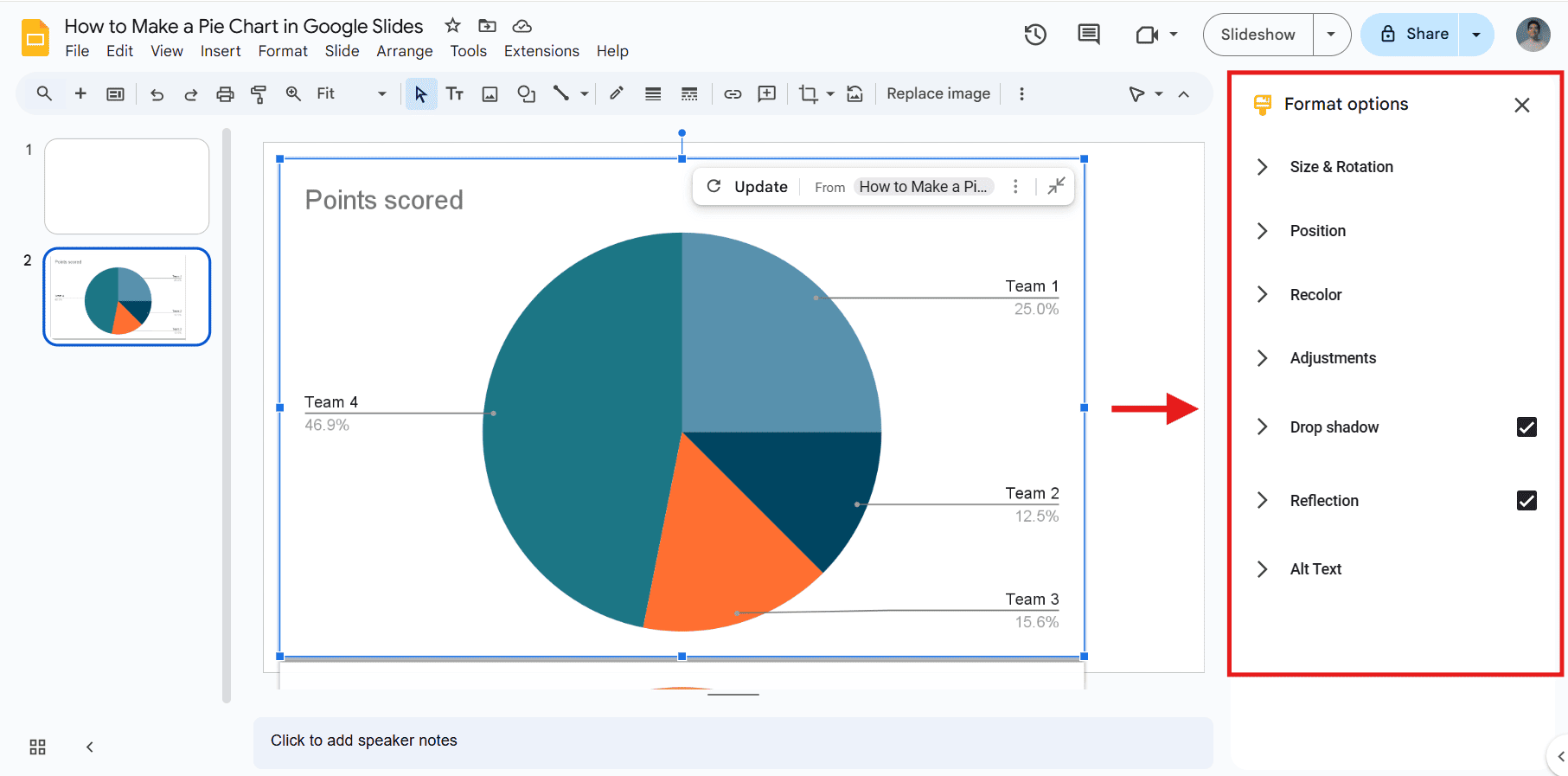
And that's it! Now, you can edit your pie chart to suit your style.
If you want to learn more about editing options to make your pie chart stand out, we'll explore what you can do in the next section.
How to Edit a Pie Chart in Google Slides
Customizing a pie chart in Google Slides helps make your data more engaging and visually appealing. If you haven’t added your pie chart to Google Slides yet, here’s a quick recap: Click Insert > Chart > Pie Chart.
Note: To access the most important editing options, such as modifying data or chart styles, you must open and edit the chart in Google Sheets. Then, in Google Slides, click Update to apply your changes.
Step1: Edit Data
- To change the default data, select the pie chart, click the three dots in the corner, and choose Open Source.
- In Google Sheets, adjust values or add new categories. After editing your data, return to Google Slides and click Update to refresh the chart.
Here’s an example of using a pie chart to represent a company's annual revenue:
Note: To add a new data series, open the Chart Editor, go to Series, and click Add Series. Then, choose “Select a data range” and highlight the column with your new data.
Step 2: Edit the Chart Titles
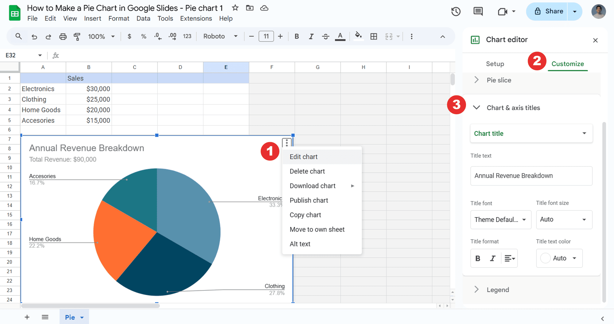
- In Google Sheets, select the pie chart, click the three dots, and choose Edit Chart to open the Chart Editor.
- Go to the Customize tab, select Chart and Axis Titles, and edit the title or subtitle.
- Click Update to refresh the pie chart in Google Slides.
Step 3: Change Colors
- Select the pie chart in Google Sheets and click the three dots in the corner. From there, choose Edit Chart to open the Chart Editor.
- Open the Customize tab and select Pie Slice. Here, you can adjust the color of each slice or change its distance from the center to highlight specific slices.
Here’s an example:
Step 4: Edit Chart Style
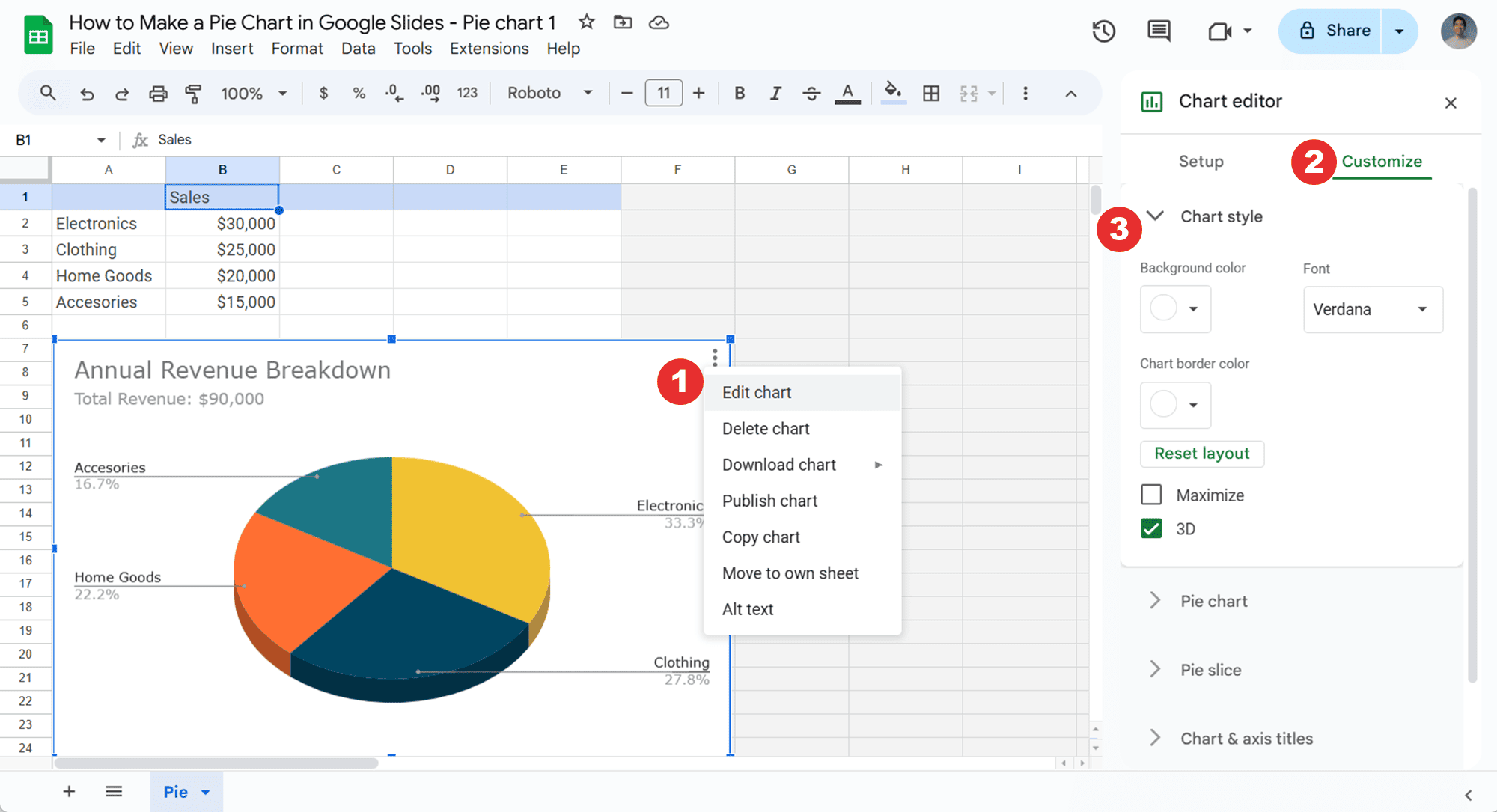
- In Google Sheets, click the pie chart and then the three dots in the corner. Select Edit Chart to open the Chart Editor.
- Next, open the Customize tab and select Chart Style. Here, you can adjust the background color, font, border color, or pie chart style.
In this example, I changed the font and style of the pie chart to a 3D design:
Step 5: Add Labels to the Slices
Depending on your needs, you may want to display additional information within the slices of your pie chart. To do this, follow these steps:
- In Google Sheets, select the pie chart and click the three dots in the corner. From there, choose Edit Chart to open the Chart Editor.
- Next, go to the Customize tab and select Pie Chart. Here, you can add labels to the slices and create a donut chart by adding a hole in the center.
Here’s an example:
Step 6: Use the “Format Options” Tab (optional)
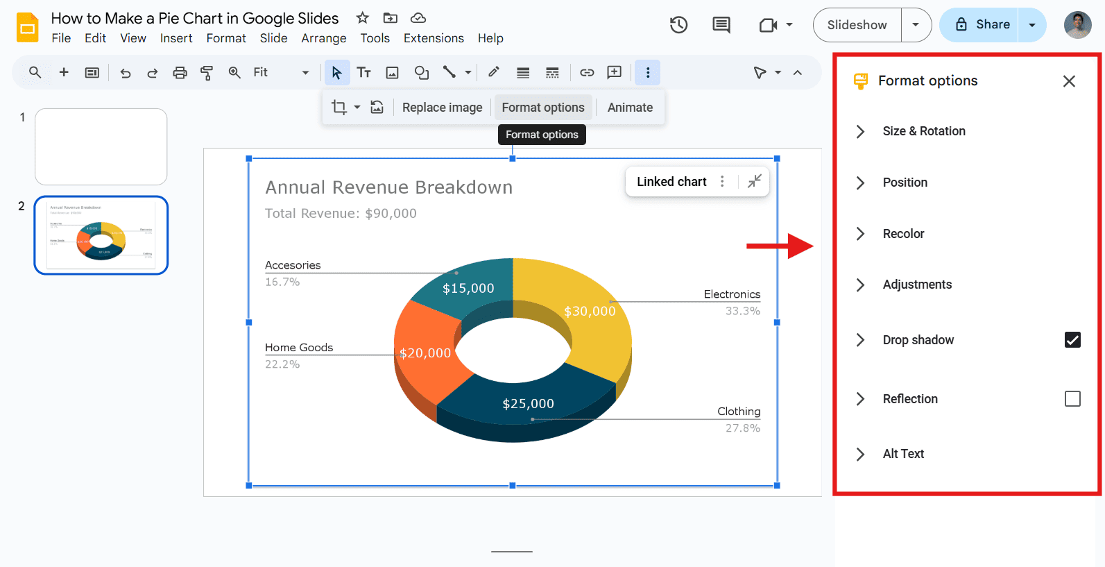
To make small visual changes related to the design of your pie Chart, you can also use the “Format Options” from Google Slides. To do this, just follow these steps:
- In Google Slides, select the pie chart and click Format Options in the toolbar.
- Select an option to customize your pie chart.
For additional information, here is how to format a chart in Google Slides.
Tip: Use clear, easy-to-read labels and apply contrasting colors for different slices to enhance visibility. This will improve clarity and impact.
Google Slides Pie Chart FAQs
Note: Google Slides doesn’t have a “Chart Editor” option like Google Sheets. In Google Slides, you can make minor visual adjustments using the "Format Options." However, for more advanced editing, such as modifying data or chart styles, you need to open and edit the chart in Google Sheets.
How to make a pie chart in Google Slides?
Go to Insert > Chart > Pie. Then, select your pie chart, click the three dots in the corner, and choose Open Source to edit it in Google Sheets.
How do I open the chart editor in Google Slides?
- Step 1: In Google Slides, select the chart, click the three dots in the corner, and choose Open Source to edit it in Google Sheets.
- Step 2: In Google Sheets, select the chart, click the three dots, and choose Edit Chart. This will open the Chart Editor.
How do I change the colors of a pie chart in Google Slides?
To change the colors of a pie chart in Google Slides, you must edit it first in Google Sheets.
- Step 1: Select your pie chart in Google Slides, click the three dots in the corner, and choose Open Source to open it in Google Sheets.
- Step 2: In Google Sheets, select the chart, click the three dots, and select Edit Chart to access the Chart Editor.
- Step 3: In the Chart Editor, go to the Customize tab, select Pie Slice, and change the colors as needed.
- Step 4: In Google Slides, click Update to refresh the pie chart.
How to make a 3D pie chart in Google Slides?
- Step 1: In Google Slides, insert a pie chart. Go to Insert > Chart > Pie.
- Step 2: Select the chart, click the three dots in the corner, and choose Open Source to edit it in Google Sheets.
- Step 3: In Google Sheets, select the chart, click the three dots, and choose Edit Chart. Then, go to the Customize tab, select Chart Style, and enable the 3D option.
- Step 4: Click Update in Google Slides to apply the 3D chart.
Can I add animations to a pie chart in Google Slides?
Yes, you can add animations to a pie chart in Google Slides by selecting the chart and clicking
“Animate” in the toolbar. This will open the Motion pane on the right side of your screen.
Looking for presentations that wow? 24Slides is your solution!
Creating a pie chart in Google Slides is a great way to present data visually. However, stunning presentations go beyond just adding data to slides. That’s where 24Slides comes in!
While tools like Google Slides help you create the basics, 24Slides goes a step further by providing +12 years of expertise in presentation design.
With 24Slides, you can focus on what truly matters—crafting exceptional content—while leaving the visuals to the experts. With our fast turnaround times, you'll receive a fully editable presentation that will wow your audience in no time.
But wait, it gets even better! You can experience all this magic for just $1. We’ll create a stunning, editable one-slide presentation that beautifully represents your brand for just a single dollar!

Ready to take your slides to the next level? Start here!
- Ensuring Brand Consistency: How to Make a Successful Brand Implementation Strategy
- Expert Tips for Creating Charts, Diagrams, and Tables in Google Slides
- How to make a Flowchart in Google Slides (+ Free Templates)
- How to Make a Pyramid Chart in Google Slides? + Free Template
- How to Make a Timeline in Google Slides? Guide for beginner


