10 Tips for creating an effective training presentation
Creating a training presentation is not a simple task. Unlike your usual PowerPoints, a training deck should convey work-related information in a way that keeps your team engaged and creates a positive learning experience. Quite a challenge, if you ask me - especially in online environments.
That’s why today I’ve got a little help from the 24Slides presentation designers. They work on thousands of eLearning slides for companies every month, so they pretty much know what it takes to create an impressive training deck.
By the end of this post, you’ll have learned:
- What exactly a training presentation is
- The benefits of corporate training
- 10 training presentation tips you can execute right now
Let’s begin!

What's a Training Presentation?
A training presentation is a corporate learning material that helps build the right skills employees require to perform their jobs. For optimal results, ideal training presentations showcase the specialized knowledge in well-structured, easy-to-read slides, and encourage active participation during the whole learning experience.
To give you an idea, common training presentation topics include company policies, safety and health at work, cybersecurity, industrial processes, and more.
Why Should Businesses Provide Employee Training?
Employee training is a business investment, and as such, it’s normal for higher-ups to question whether some corporate learning and development activities are needed. However, as Henry Ford said, “The only thing worse than training your employees and having them leave is not training them and having them stay!”
And if that’s not enough reason, here are some long-term benefits you can list to show the value of employee training in your organization:
- Training sessions leverage new employees’ productivity faster
- Employee training reduces the chances of errors and accidents on the job.
- Well-trained employees need less supervision, which translates into more time for managers to dedicate to their own tasks.
- Learning and development activities help increase employee retention and job satisfaction.
- Constant employee training makes it easier to identify the team’s weaknesses and creates improvement opportunities for the whole organization.
Now that we understand why staff training is important, let’s see how to create a good training presentation.
Top Tips for Creating an Effective Training Presentation
What we commonly call “effective presentation” is the right balance of two elements: the content you provide and how you deliver it. The first part is on your expertise and every piece of information you can share. But the second part is where the real magic happens.
How do you convey your knowledge? How can you make the online learning experience one to remember? Well, a lot relies on the way you present that information. In this section, we’re going to cover both sides through 10 training presentation tips:
#1 Showcase the knowledge of your company’s experts
Internal expertise is a top learning resource many companies fail to see. Just think about how much your sales head or finances specialist can say about the best practices and workflows from their respective areas. Or the industry trends and developments they experience in their day-to-day activities. You don’t need to look outside the office when you already have expert sources that can provide you with valuable know-how for your training slides.

And don’t curb to technical topics. If the training is on leadership or negotiation skills, why don’t you invite a project manager or sales rep to talk about their experiences? This is a fantastic way to recognize employees as experts and promote team engagement at the same time.
#2 Use your visuals wisely
Visual content is ideal to catch your audience’s attention in a matter of seconds. Plus, studies confirm that visuals help process information faster and facilitate learning. However, this doesn’t mean we should plaster graphics and illustrations all over our slides. Instead, use your visuals strategically only for what’s relevant.

It’s like highlighting a textbook. A mark signals the main idea from the hundreds of words in every chapter. But what’s the point if you’re going to highlight the entire page? It would lose its whole purpose!
As Benny Prasetyo, Design manager from 24Slides, says:

So keep that in mind. Your images, icons, and other graphics are not merely decorative devices. They tell people where to look and have the power to amplify your key messages.
#3 Appeal to different learning styles
According to the VARK model, there are four main learning styles: visual, auditory, reading/writing, and kinesthetic. And people tend to prefer one or two modalities over others. The good thing is that you can appeal to the four of them within your training PowerPoint presentation. Here’s how:
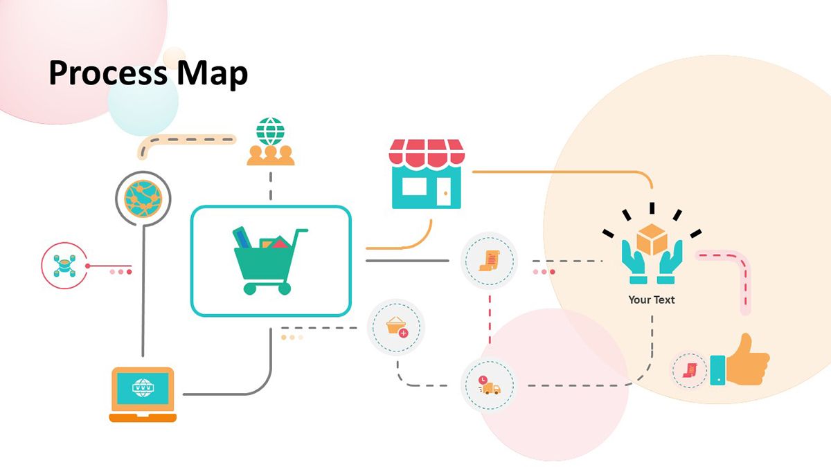
- For visual learners, maps, flow charts, and process diagrams are the way to go. They respond better to all these devices that explain something graphically instead of words.
- Auditory learners make the most out of synchronous training because they learn by hearing and discussing ideas. However, you can also adapt your PowerPoint materials to them. Think about adding audio files or linking to podcasts that further expand the main topic. Another great way to appeal to aural or auditory learners is using a conversational style in your slides, so they can read your PPT as if you were talking directly to them.
- People who process information through reading and writing will appreciate text-based explanations and assignments. Lists, quotations, and case studies are ideal for this type of learner.

- For the kinesthetic modality, you can showcase personal experiences or feature practical exercises that allow students to apply what they’ve learned. We’ll talk more about this kind of content in the following sections. But bear in mind that kinesthetic learners are “tactile” and prefer to assimilate new information by exploring it in the real world.
To sum this point up, add elements in your presentation that respond to the four learning styles, and you’ll get an immersive and more dynamic training session.
#4 Keep it real
Want to make your corporate training relevant to your team?
Include scenarios from real situations - extra points if these examples come from their actual work. Here’s the thing: People are more perceptive to things that make an impact on their lives. So, if you connect your session to what they go through in their daily tasks, you’re adding emotion and making your training 10x more relatable.
Ideally, your presentation gives solutions to an issue the business has identified. In this case, you need to explore a little: What has changed or happened in the company that employees require training? How’s the day-to-day of the areas involved? What’s the ideal scenario the company expects?
Now, use your findings to integrate realistic situations as examples or exercises that show trainees the value of your session. The key to an engaged and motivated audience is to keep things real.
#5 Make use of storytelling
Effective training is more than informative sessions. The real objective is to spur change. You want to take employees from point A to point B in their development, and one of the most powerful tools to inspire action is storytelling.
In a few words, storytelling is the art of using a story to communicate something. It might not sound like a big deal, but stories speak to the emotional side of humans, and that’s how you can start building a connection that makes every session memorable.
Some ways the 24Slides designers help incorporate storytelling into training presentations is through comics, animated slides, and PowerPoint illustrations.

If you’re keen to challenge the status quo in your team, check out these 7 storytelling techniques to create a compelling training deck.
#6 Take every chance to engage with your audience
Getting active participants during online training is like finding the saint grail nowadays. With muted mics and off-cameras, sometimes you don't even know if someone is listening on the other side. But hang in there.
In this section, I will show you some interactive elements you can use to boost your audience engagement.
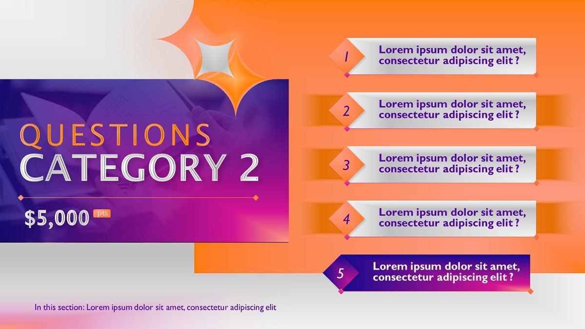
Usually, the host would end the presentation with an “Any Questions?” slide, but what about you asking the questions? Inquiry your audience’s minds and create open questions for anyone to share their opinions. This is a good old trick with the potential to spark great-in-class discussions. You can even transform it into a gamified experience with slides like the one you see above.
Online audience engagement tools such as Slido, Mentimeter, or Kahoot make it super easy to create interactive quizzes and polls. The cool thing about them is that they give you a presentation code, which allows your audience to send their answers and see the team's results in real-time.
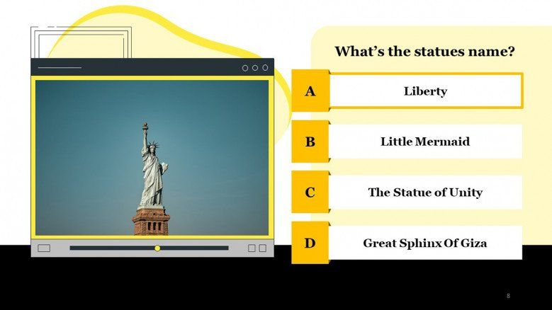
But if you prefer a more traditional approach, there are PowerPoint slides that can do the trick too. Take this multiple-choice quiz template as an example. It comes with a wide array of designs to hold your participants’ attention while assessing their knowledge. You just need to insert questions and alternatives regarding your topic, and voilá!
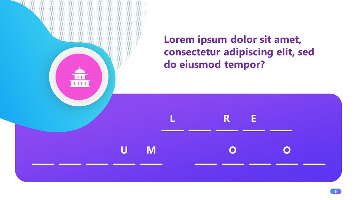
Self-assessment activities are a great way to engage with your audience - even when you’re not there to guide them! Here’s a creative quiz template in PowerPoint you can use to add fill-in-the-blank exercises, short-answer questions, and multiple-choice tests to your training deck.
#7 Brand your corporate training deck
Considering that training presentations talk to one of the company’s most important stakeholders (the employees), it should be a no-brainer to keep them on-brand.

But it’s more than giving a professional look to your slides. Adding the company’s brand to training materials shows your team that you care. You’re making the same effort to deliver a polished product to them as the company does to the customers. And that speaks volumes!
Plus, keeping visual consistency across all materials helps your team become familiar with the brand and reinforce that they’re part of the company's activities.
We’ve got a whole article on why branding is essential in presentations, but at this point, it’s clear that spending some time on the aspect of your slides provides more benefits to the business than not. So, remember to inject the brand’s identity into your training decks.

#8 Close with summary slides
How often have you seen participants more worried about taking notes from your slides than actually following your speech? This is a common situation in learning scenarios, and it’s not because your participants don’t care about what you’re saying. Quite the contrary, they want to take it all in.
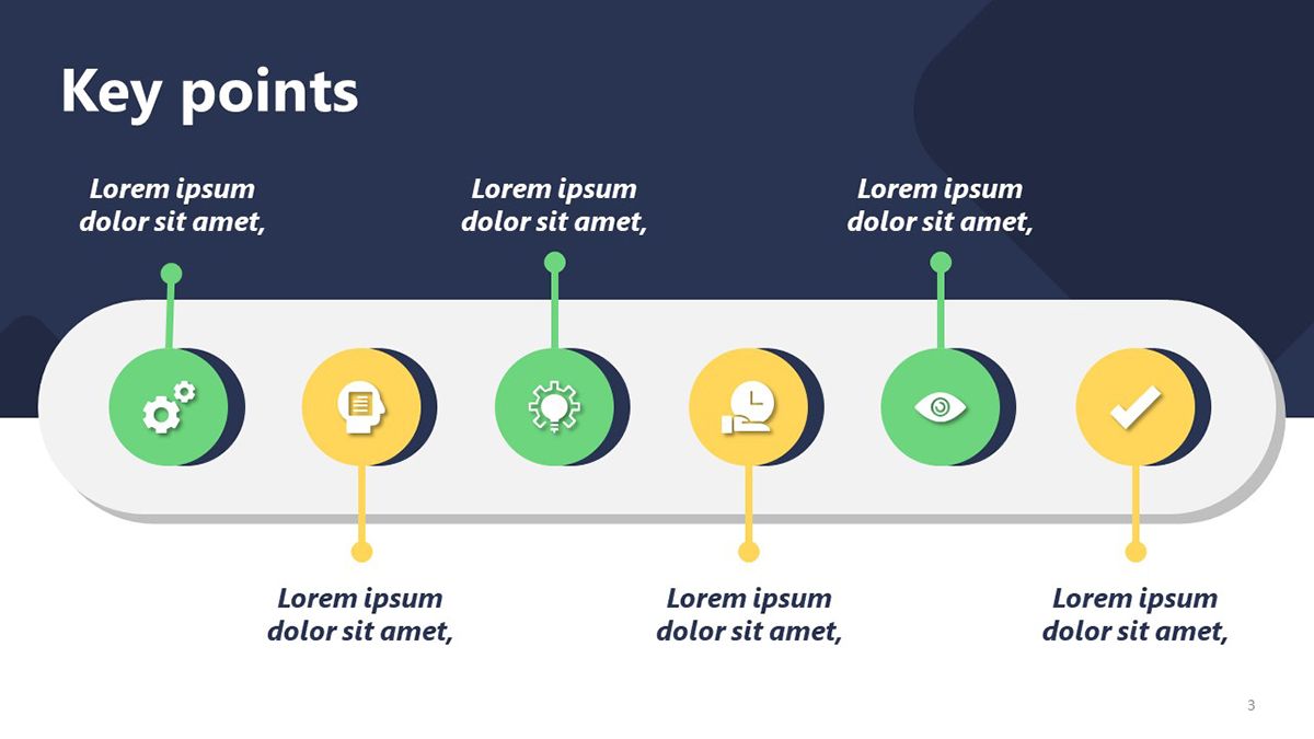
And you can make their learning experience easier by simply adding summary slides. These final slides contain the key points from your lesson and help viewers retain the essentials.
This way, you ship away your participants’ worry of missing something important, and you get another chance to reinforce your main messages. Everybody wins!
#9 Make your presentation accessible
“Accessibility” is a term that has gained popularity in the last few years, and it refers to the practice of ensuring people with disabilities can access the same information fully and independently as people without disabilities. This is extremely important in eLearning because you want everyone in the organization to benefit from your lessons.
For instance, employees with hearing difficulties might have a hard time watching an instructional video with no captions. Likewise, participants with visibility issues might need an easy-to-read font size in the slides or color contrast in your presentation visuals.
If you want to start now, PowerPoint has an accessibility checker that gives you a detailed report on what you can do to improve your slides. To activate it, follow this route: File tab > Information > Check for issues (next to Inspect Document) > Check Accessibility
You might be surprised by all the details we take for granted, but they make a huge difference to people with different abilities.
#10 Don’t Underestimate The Power of Your Presentation Design
All these good practices confirm that a good design can enhance any corporate learning experience. It helps your employees better comprehend information. It signals the importance of each item in your slides and how they should be read. A good design provides structure and visual flow. And the list can go on, but I prefer you see for yourself.
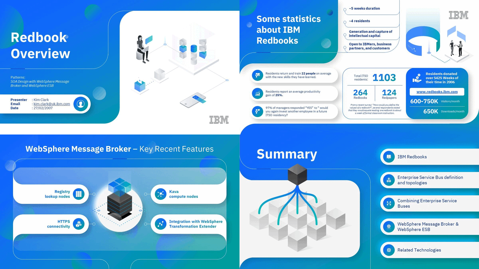
Damilka Rojas, Design manager at 24Slides, gives us expert input on the right design approach for effective training presentations:
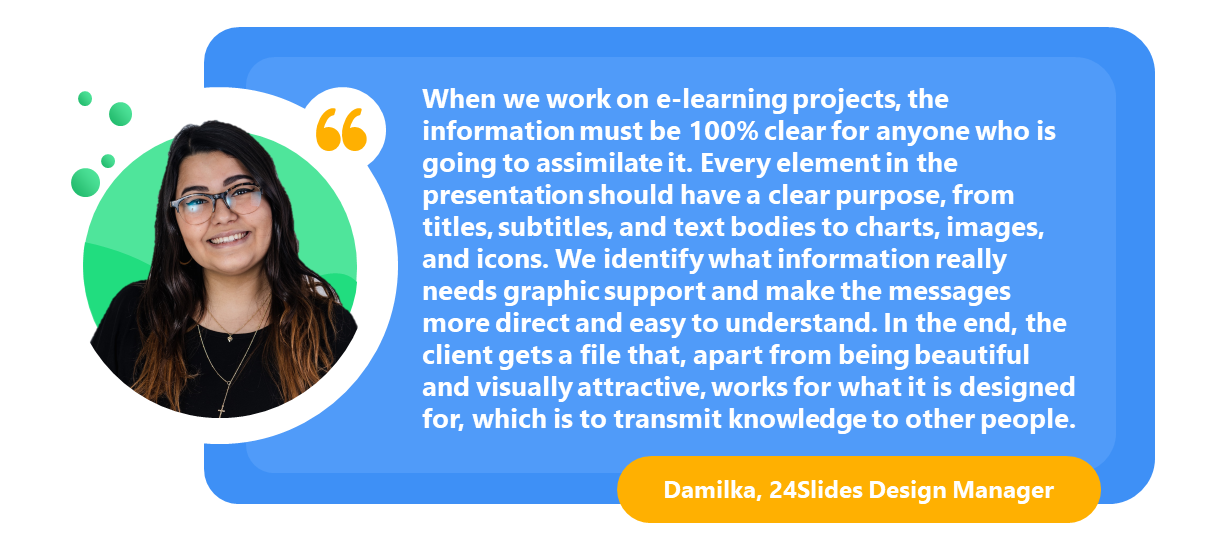
Plus, many training slides are stand-alone materials with the task of conveying information without a live instructor. That’s when you can rely on a good design to deliver a coherent interpretation of your lessons.
Upgrade your training presentations today!
Now, it’s time to put these training presentation tips into practice. Whether you apply one or all of them together, I’m sure you’ll see a marked difference in your new slides. But if you have several presentations to upgrade or designing in PowerPoint is not exactly the most productive way to spend your time, let the 24Slides team handle it for you!
Our expert designers can create stunning slides to draw your audience’s attention while keeping the professional look your training decks deserve. They provide presentation design support to some of the biggest companies worldwide, so rest assured your slides will be in good hands. Ready to take your presentations to the next level?


