How to Create a Pie Chart in PowerPoint (+Free Templates)
Want to make your data visually engaging with minimal effort? You've come to the right place! In this article, you'll learn how to quickly make a pie chart in PowerPoint.
By following this simple step-by-step guide, you’ll captivate your audience from start to finish. With free templates included, you'll be presenting like a pro in no time. I will also explain how to edit a pie chart and answer FAQs about it.
Let’s get started and elevate your presentation game!

Here are the topics we'll cover:
- What is a Pie Chart?
- How to Make a Pie Chart in PowerPoint
- How to Edit a PowerPoint Pie Chart
- Free PowerPoint Pie Chart Templates
- PowerPoint Pie Chart FAQs
- Want presentations that stand out? 24Slides has you covered!
What is a Pie Chart?
A pie chart is a circular graph split into slices to show proportions. The entire pie represents the whole dataset, and each slice represents a part of that whole.
Pie charts are a clear and simple way of presenting data, making it easy for your audience to grasp complex information at a glance. They immediately identify the largest and smallest values.
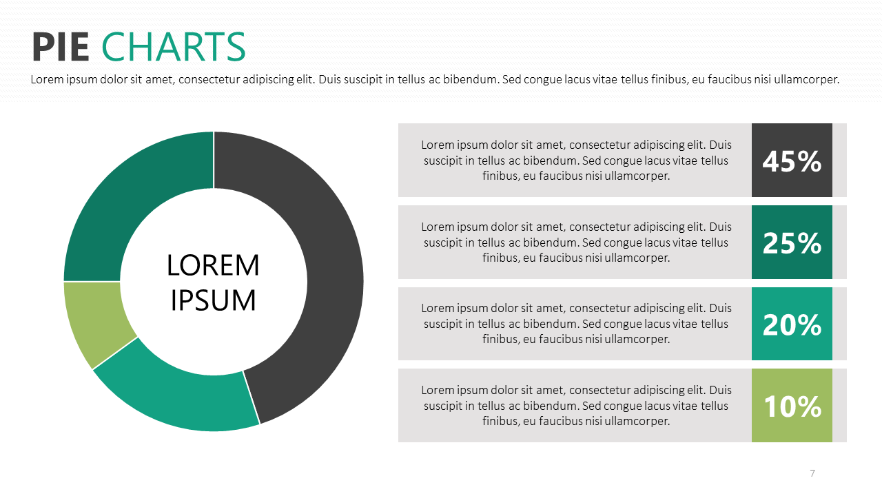
Imagine you're analyzing your team's monthly sales performance. A pie chart can easily show you how each product category contributes to the overall revenue, giving you a clear visual breakdown of the data.
Here’s an example:
How to Make a Pie Chart in PowerPoint
Step 1: Launch PowerPoint
- Open PowerPoint and start a new or existing presentation.
Step 2: Create a new slide
- Go to Home > New Slide (click the arrow) > Blank. This will give you a clean layout.
Tip: You can also change your existing slide layout. Right-click on the thumbnail image of your slide on the left, select "Layout," and choose your favorite option.
Step 3: Go to the Insert tab
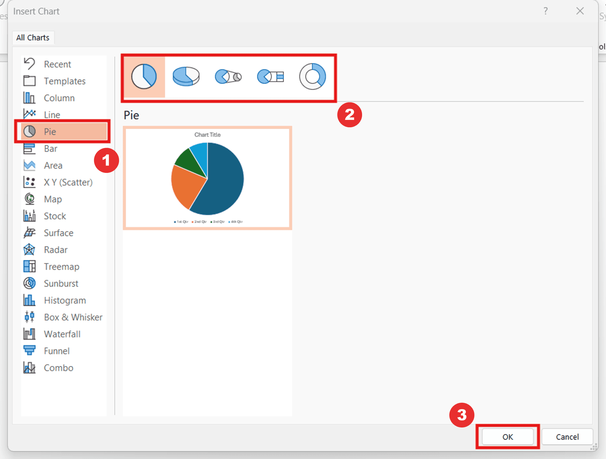
- Go to the Insert tab and click on Chart. This will open the “Insert Chart” pop-up window.
Step 4: Insert the Pie Chart
- Click on Pie from the list on the left side. Then, choose your favorite pie chart style and click OK.
For this example, I’ll choose the classic pie chart.
Step 5: Enter your data
- A spreadsheet window will open with default data. Enter your own categories and values, then close the spreadsheet when done.
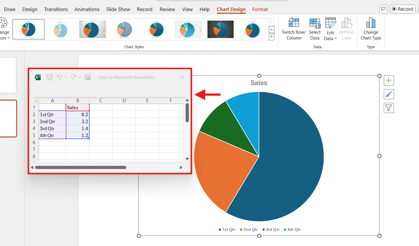
Tip: If you accidentally close the spreadsheet, right-click on the chart and choose “Edit Data.”
Step 6: Customize your pie chart
- Select the pie chart and use the icons next to it to edit. Here, you can adjust the chart elements, change the style and colors, and apply filters.
Here's a quick example of a pie chart showing units sold for different tech products:
If you want to know more about the options to edit a pie chart, we will review what you can do in the next section.
How to Edit a Pie Chart in PowerPoint
Customizing a pie chart in PowerPoint lets you make your data more engaging and visually clear. A few tweaks can make all the difference. Here are the main customization options:
Change the Chart Type
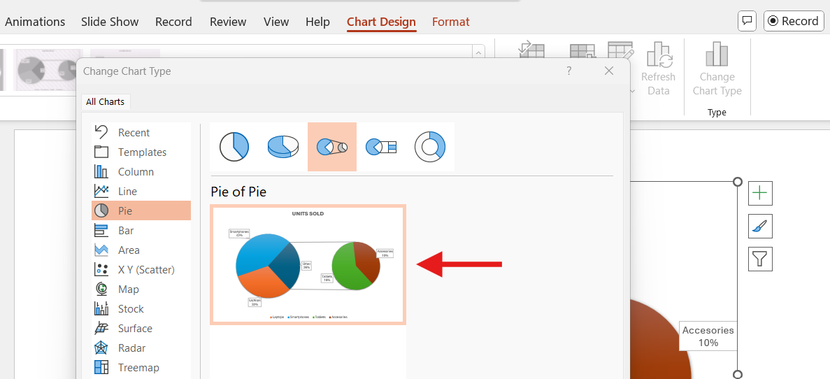
Select your pie chart, open the Chart Design tab, and choose Change Chart Type. You can switch between pie chart styles (such as 2-D and 3-D). For example, the "Pie of Pie" option breaks out smaller percentages to make them stand out. Here’s an example:
Edit Data
You can adjust the data by selecting the pie chart and going to Chart Design > Edit Data. This lets you adjust values or add new categories. To add a new row, simply type your new category and value in the next empty row to add it to the chart.

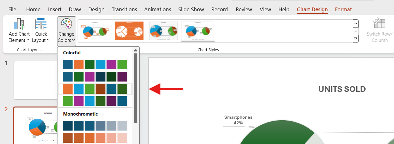
Change Colors
Customize the colors of your pie chart by selecting it and using the Change Colors option in the Design tab. To adjust individual colors, select the slice you want to change, right-click, and choose the Fill option. You can also add images and textures to give your pie chart a special touch.
Apply Chart Styles
To apply different styles to your pie chart, select it and click on the Chart Styles option under the Design tab. This allows you to quickly change the overall look of your chart.

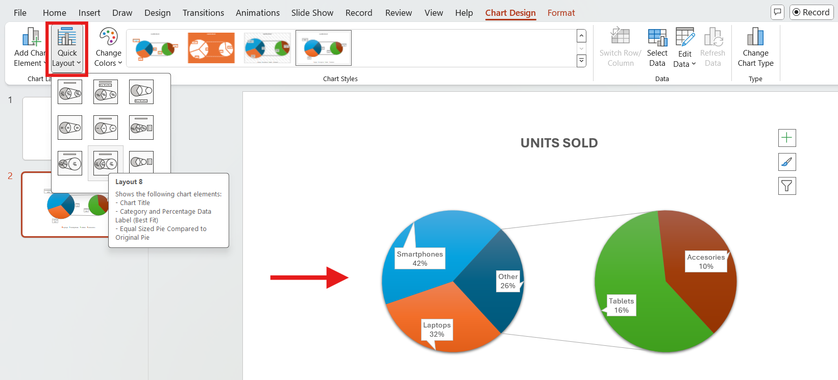
Adjust Chart Layout
You can change the overall layout of your design by selecting Quick Layout in the Chart Design tab. This lets you change label placements and other elements.
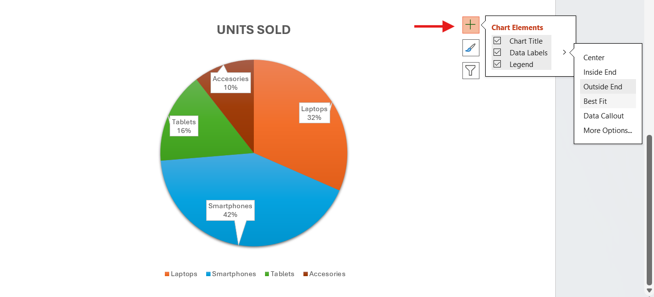
Add Data Labels
Select the chart, click the plus sign (+) next to it, and check Data Labels. By selecting More Options, you can add data labels for additional information, choosing to display values, percentages, or both.
Highlight Individual Slices
To emphasize a segment of your pie chart, click on it and drag it away from the center. This eye-catching visual effect highlights key data points, ensuring your audience grabs your attention. Here’s an example:
Format Individual Slices (optional)
You can format slices by clicking to select them. Then, go to the Format tab to change colors, add borders, or apply shadows to enhance your pie chart. You can customize your entire chart by selecting all the elements and following the same process. Just remember to ensure brand consistency.
Tip: Limit the number of slices to fewer than six. Use clear, easy-to-read labels and apply contrasting colors for different slices to enhance visibility. This will improve clarity and impact.
For more information, here are how to use charts effectively and the best tips for mastering the art of presenting data.
Free PowerPoint Pie Chart Templates
It’s no surprise pie charts are a favorite for presenting data—they’re the easiest way to show percentages of a whole. However, creating them from scratch can be time-consuming.
With free pie chart templates, you can easily enhance your presentation with visually appealing charts. Best of all, no design skills are needed to create them.
Looking for the best PowerPoint pie chart templates? Look no further! Check out our Templates by 24Slides platform for hundreds of stunning, free templates designed to elevate your presentations.
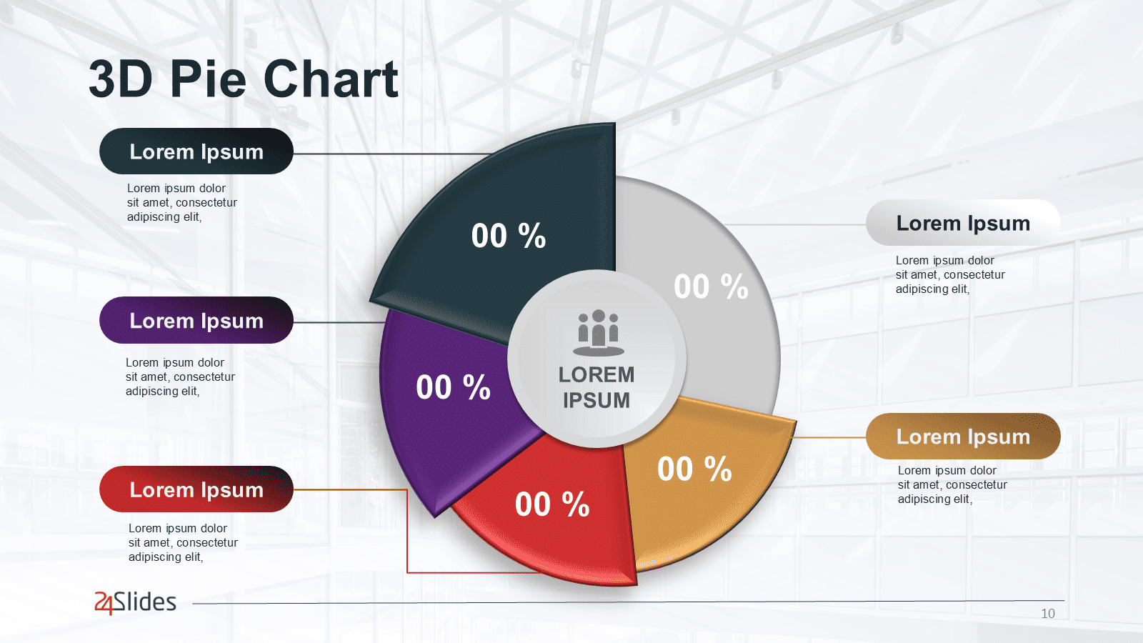
Whether you need a 2D, 3D, or even a segmented pie chart, these templates save you time. Each template is fully editable—just download, add your data, and adjust colors and labels to match your brand or message.
Have fun customizing them!
PowerPoint Pie Chart FAQs
How to insert a pie chart in PowerPoint?
Go to Insert > Chart > Pie. Then, pick a style and click OK.
How can I make a 3D pie chart in PowerPoint?
Go to Insert > Chart > Pie. Next, choose “3D Pie” and click OK to add it to your slide.
How to add a new category to your pie chart?
Click the next empty cell in the "Categories" column and type your category name. Then, enter the corresponding value in the cell to the right, and the chart will update automatically.
How to rotate a pie chart in PowerPoint?
Right-click on your pie chart and choose Format Data Series. Then, adjust the Angle of first slice to rotate the chart.
What are the different types of pie charts available in PowerPoint?
- Standard Pie Chart: Displays data as slices of a whole.
- 3-D Pie Chart: Adds depth to make the pie chart more dynamic.
- Doughnut Chart: A pie chart with a hole in the center. Perfect to add more information.
- Pie of Pie Chart: Breaks out smaller slices into a second pie chart for emphasis.
- Bar of Pie: Divide smaller slices into a bar chart to highlight them.
How to show percentages on a pie chart in PowerPoint?
Select your pie chart, go to Chart Elements (the "+" icon), and check the Data Labels box. Click the arrow next to Data Labels to choose the label position, then go to More Options.
In the Format Data Labels pane, uncheck any options you don’t want (like Value) and check Percentage.
How can I change the colors of a pie chart in PowerPoint?
Select your pie chart and go to the Chart Design tab at the top. Then, click on Change Colors to choose a new color palette. To change the color of a specific slice, right-click on it and choose Fill. Use the selection handles to ensure you only select one slice.
How do I customize the labels on a pie chart in PowerPoint?
Select your pie chart, go to Chart Elements (the "+" icon), and check the Data Labels box. Click the arrow next to Data Labels and select More Options. Then, customize your labels in the Format Data Labels pane.
Want presentations that stand out? 24Slides has you covered!
We've learned how to create and customize a pie chart in PowerPoint. However, to truly captivate your audience, you'll need a lot more than a polished pie chart. So, why not focus on your content and let the experts handle the rest?
Our team of over 200 expert designers specializes in transforming simple slides into stunning visual experiences. We ensure that your slides not only look great but also effectively convey your message, leaving a lasting impression on your audience.
With our fast turnaround times, you’ll get a fully editable presentation in no time that will wow your audience. And now, get ready for an amazing offer! You can experience all this for just $1. We'll create a unique, editable one-slide presentation that reflects your brand for only one dollar!

Looking to impress with your slides? Start with this!


