Free Presentation Icons PowerPoint Template
Boring presentations should be a thing of the past. Nobody ever wants to sit in front of a mind-numbing, boring presentation. I know I don’t. The good news is there are so many ways you can transform a sleep-inducing presentation into something that will absolutely blow your audience away. You can use graphics, videos, and other graphic elements like icons to spice up your presentations.
Don’t worry if you don’t know anything about icons. I’ll show you where you can download the best free presentation icons for PowerPoint later on. For now, let me show you why icons are so powerful in presentations.

Why Use Icons For Your PowerPoint Presentation?
Icons are here to stay. They’re not going anywhere. In fact, icon use has been on the rise not just in presentations, but also on websites, mobile apps, flyers, leaflets, etc. If you don’t believe me, then let me illustrate the difference between a slide without icons and a slide that uses icons. Check out the two images below and decide which of these two slides look better:
Slide 1 (no icons):

Slide 2 (with icons):

Would you say Slide 1 looks better? You’re most probably shaking your head “no.” When compared with Slide 2, Slide 1 seems too basic and far too dull. The icons on Slide 2 make the text stand out; in fact, they help support the text. I think Slide 2 looks easier on the eyes too.
So, here are some of the top benefits of using icons in presentations:
- Icons help you save a lot of time creating slides
Instead of formatting your slides the traditional way, that is, by using bullet points (or worse, typing out entire paragraphs), you can simply insert icons on your slide. You don’t need to worry about typing out lengthy texts on your slides, and then worrying about the grammar and making it look good to your audience.
You simply need to locate the right icons for your text. If you’ve already downloaded icons to your computer, simply hit the insert button on PowerPoint and insert your selected icon. Move it around the slide until you find the right spot, add some text if you need to, and voila! You’ll have your slides ready in just a few seconds!
- Icons are easily understood by your audience
Many icons are universally recognized, hence, you don’t need to include any explanations for most of them. Of course, if you plan on explaining any of the icons verbally, that’s also fine. You’re pretty much free to say anything you want to your audience, it’s just that slide design is an entirely different thing. You want your audience to pay attention to what you’re saying, you don’t want them to read your slides!
With icons, your audience only needs to look at them on your slide and they’d usually know instantly what the icons stand for. This prevents them from spending too much time reading your slides. Instead, it allows them to focus their entire attention on your speech and your presentation’s message.
- Icons make your slides look ‘cleaner’
White space (or negative space) is important in any aspect of design, whether it be presentation design, website design, graphic design, etc. White space is the space between elements. The more space you have between elements, the better and easier it is for your audience to process the information you’re presenting on the screen.
When you use icons on your presentation slides, you’re essentially substituting all the space that several lines of text would have taken up with just a single icon. You don’t want too many things going on in your slides – that will be too distracting and will drive your audience’s attention away from your presentation.
The fact of the matter is you don’t want your audience playing on their phones instead of listening to your presentation! So, give them the incentive to do so – make sure your slides are easy on the eyes. Use icons wherever possible and declutter your slides.
- Icons and graphics are more memorable than plain text
I bet you already know this for a fact. Icons, especially well-designed ones, are bound to capture your audience’s attention. I’m sure you’d feel absolutely ecstatic if people came up to you after your presentation and told you how awesome your icons and graphics were!
Look at it this way: when you use icons properly, they’ll help drive your presentation message home. And that’s basically what every presenter wants to achieve – to have their message received and understood by their audience.
Top 5 Places To Download Free Icons PowerPoint Templates For Your Next Presentation
Downloading the right icons can mean the difference between your presentation’s success or failure. But where exactly can you download the best icons on the web? Well, there are quite a number of good places where you can download high-quality (and free!) icons. Here are some of the top ones:

1. PowerPoint itself
Surprised? You shouldn’t be! At least not anymore. Not too long ago, inserting icons meant downloading them from third party sites or even creating them from scratch! The good news is PowerPoint has finally caught up with the present and met their massive user base’s demand for easier icon insertion. The bad news? Not everyone who’s installed PowerPoint on their computers has access to the built-in icon search feature. Only Office 365 subscribers with the latest version of the software can take advantage of this new feature.
If you have an Office 365 subscription, try the steps below:
Click Insert>Icons. The Icons sidebar will appear on your screen (you need to be connected to the Internet). You’ll then be presented with hundreds of icons in 26 categories. Here’s a screenshot:
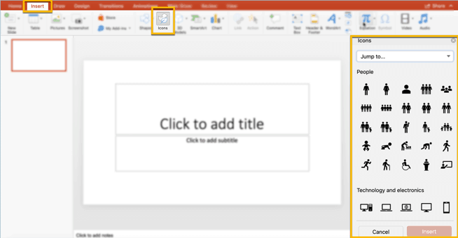
Once you’ve selected an icon(s) you want to use, just click it and hit the Insert button. The Design Ideas tab will then appear next to the Icons tab in the sidebar.
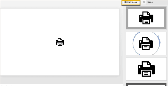
You can use any of the preformatted design ideas, or you can edit your icons manually. Just click on the icon and the Graphic Format tab will show up on the ribbon.
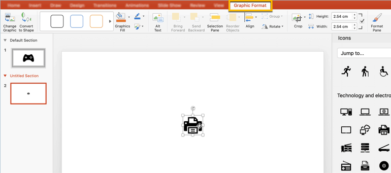
As you can see in the screenshot above, you have a lot of different options to customize your icon. If you want to edit specific components or elements that make up your icon, you’d need to hit the Convert to Shape button (or right-click to see this option). You’ll get an Alert message like below:
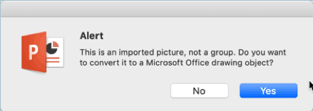
Hit ‘Yes.’ You’ll then be able to ‘Ungroup’ the various elements or shapes that make up your icon by right-clicking the icon itself.
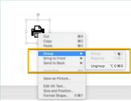
Here’s what my icon looked like after I ungrouped it and moved some elements around:
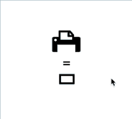
As you can see, inserting icons on PowerPoint can’t get any easier than this. So, if you’re someone who uses icons a lot, then you may want to shell out some cash for an Office 365 subscription. If not, don’t worry, the next couple of websites below are going to help you out a ton with free PowerPoint icons and graphics.
2. Templates by 24Slides
Our professional in-house designers have created hundreds of free icons which you can use alongside our collection of free PowerPoint templates. From free business icons for PowerPoint to science icons – and everything in between – we’ve got you covered. Here’s a complete list of our most popular free presentation icons you can download today:
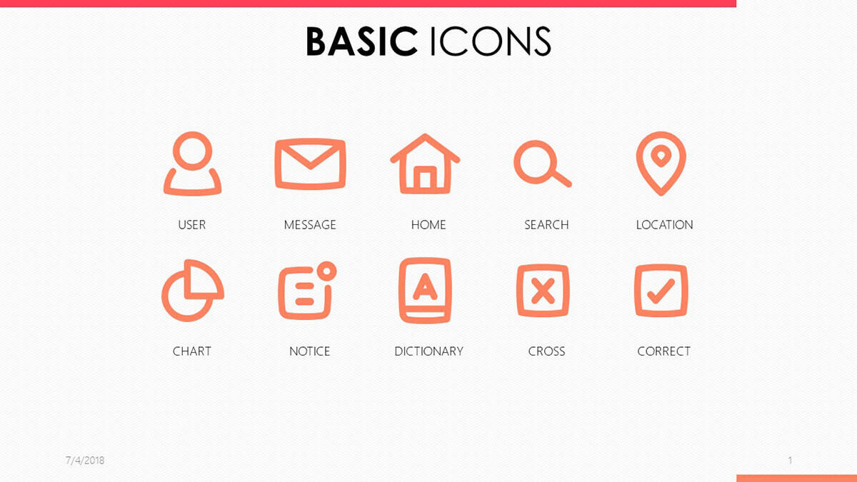
In this 3-slide PowerPoint template, you’ll have a select number of icon designs to choose from. These icons work particularly great for presentations that require the use of charts, show important messages or definitions. Or if you just want a simple PowerPoint person icon, you can also download this template. Additionally, you can also use these icons if you’re using a menu or navigation system for your slides.
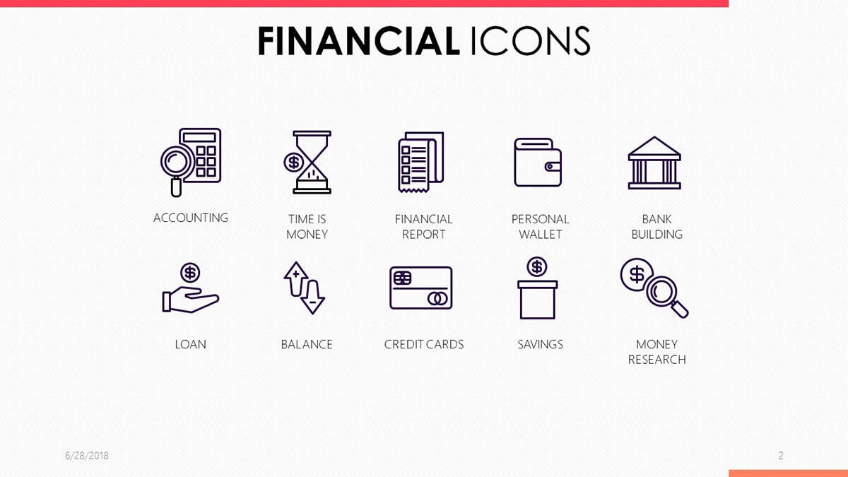
Presenting financial data doesn’t have to be difficult and complicated anymore. You don’t need to bore your audience with plenty of texts and numbers. Most of them can easily be replaced with any of the icons included in this free 3-slide icon template pack. You can use these to present your financial reports, accounting reports, and other financial transactions.
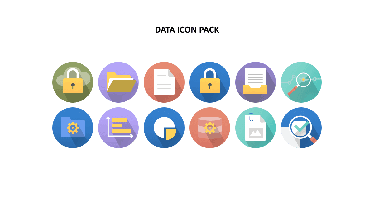
Presentations are all about data – whether you’re presenting in front of an academic or business crowd, you’ll find something you can use in our data PowerPoint icons pack. Numerical or graphical data are best headlined by fun icons like you see in this template. It offsets the mind-numbing boringness of traditional data presentation styles and provides a burst of color and pizzazz that will surely impress (or at least awaken) your audience.
If you need to present your project milestones or share some very important dates with your audience, then you can’t go wrong with the icons in this 9-slide template pack. Whether you need to present individual, weekly or monthly dates, this template pack won’t disappoint you. The icons are super easy to edit so if you need to change the month or the date to something else, you can quickly do so.
The good news is this template pack isn’t just all about the icons. If you need to get something done by a certain date, you can use the to-do list template slide. Or if you need to add some text descriptions to a certain date or month, you can use one of the included slides for this very purpose. So, all you need to do is basically swap out the ‘Lorem ipsum’ text with your own, and you’re all set!
There’s a reason why you need a strategy to succeed in whatever it is you set out to do. Without the right strategy, you could very well be wasting your time. And that’s exactly what’s going to happen if you don’t make use of the right icons to present your strategy to potential investors, management, board of directors, CEOs, and similar audience members.
If your strategy isn’t presented in an easy to understand manner, then you may lose your only chance to persuade your audience to follow your call to action (that is, approve or suggest improvements to your strategy). Maximize your chances of approval by using the right icons that will help convince the people who’ve got the final say in your strategy’s sound implementation and eventual success.
Some people may perceive corporate presentation slides as bullet point-filled with very little white space. Some may even think that corporate presentations needs to be in either Times New Roman or Arial font. Not that there’s anything wrong with these fonts – it’s just that there are many new and exciting fonts to choose from nowadays.
In other words, some people think corporate presentations are the exact opposite of fun presentations. But it doesn’t have to be. More and more corporate presenters are now going for modern looking presentations and leaving behind the old way of presenting yawn-inducing slides (check out examples of our top corporate clients who’ve embraced this new corporate presentation culture)!
So, don’t get left behind – download this free icon template pack and be on your way to creating fun and color-filled corporate-themed slides!

If none of the other icons template packs I’ve listed so far fit your needs, then you should check out this general PPT icons template pack. These icons work great for many different types of presentations. For example, if you’re presenting new ideas to your audience, you can make use of the human light bulb icon. If you want to show some charts, trends, or even financial data, you can choose from several suitable icons in this template pack.
You probably think you’ve only got a few choices when it comes to choosing the right icons for your Science presentation. Fortunately for you, our designers have made it their mission to make PowerPoint users’ lives easier. These fun icons will certainly breathe new life into your Science slides, so be ready to blow your audience (and your professor) away with the icons included in this 3-slide template pack!
3. Material Icons
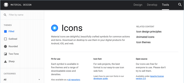
If you’re a fan of material design, then you need to check out this website. They feature thousands of free icons in this particular design language. You can choose from various themes – filled, outlined, rounded, two-tone, and sharp. When downloading, you can choose to download in either SVG or PNG format. For best results, I recommend choosing SVG over PNG because you can easily scale your icon without degrading its quality (that is, no pixelation).
4. Flaticon

With more than a million vector icons, Flaticon is one of the biggest icon repositories on the Internet. Of course, if you want to access everything, you’d need to sign up for a premium subscription. For most people, however, a free membership would suffice. You still get access to thousands of free icons. Just remember, however, you’d need to attribute the author if you opt to remain a free member.
The good news is with Flaticon, you can download files in a variety of formats like PNG, SVG, EPS, PSD, etc. For best results, however, you need to download in vector icon format like SVG. You can then drag the icons you want to use to your slides, and then edit these as you see fit. You can resize, rotate, change the color, add effects, ungroup elements, and so much more. Note, however, that for this particular feature to work you need to have an Office 365 subscription.
5. The Noun Project
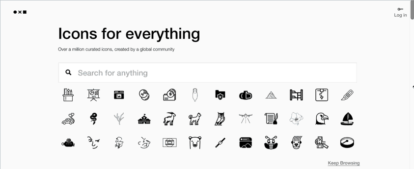
Another excellent site where you can download over a million free icons is the Noun Project. You simply sign up for a free account to start downloading icons. What’s really cool about this site is you can customize your icons before you download them. You can add a shape to your icon, you can change the background color, you can even change the icon color itself! Just take note, however, if you’re a free user, you will need to attribute the author.
If you don’t want to bother with attribution because it slows down your productivity or whatever your reasons may be, then make sure you sign up for the premium ‘NounPro’ membership. With a premium subscription, you’ll also get the added benefit of being able to access various apps for that super easy drag and drop functionality from Noun Project to your presentation slides (or any other graphics project).
Making Your Own Icons On PowerPoint
It may surprise you to know that PowerPoint is a powerful stand-alone graphics editor. So powerful in fact that you can easily edit all sorts of graphics yourself. Sure, it’s no champ like Photoshop, but for the most part, creating icons is a fairly straightforward process. You can either:
- edit existing PowerPoint vector icons by ungrouping the elements and then adding or merging different shapes, or
- create icons from scratch.
Tips To Make The Most Of Your Free Presentation Icons
Now that you know where to find the top free icons on the web, it’s time to show you how you can make the most of these icons. You can’t just download 10 or so icons from various sites and then paste them all together on a single slide (sort of like a mishmash of different icons). If you want a clean and professional-looking presentation, check out the tips below:
- Use the right kind of icons
There are literally millions of icons you can choose from. Many of them are quite easy to understand, but some may require some analysis. You don’t want to confuse your audience, so make sure you use icons that accurately represent the point(s) you’re trying to make in your presentation. For example, if you’re talking about a particular book, then you may want to use a simple book icon instead of going for something a bit more complicated and hard to understand.
- Stick to a single icon style
There are generally 3 different styles of icons you can choose from – outline, single-color filled and color-filled. No matter which style you go for, it’s important to stick to that particular style. It’s not a good idea to mix and match different styles because your presentation design is going to look messy with no cohesiveness at all.
If you’re using a color-filled icon, then it’s important to use the same colors throughout your presentation. You don’t want to use red icons on one slide and then green ones on the next slide. You should also pay attention to your overall color theme and make sure your icon choices don’t clash with your color theme.
Remember, when it comes to design, less is often more. So, keep it simple and don’t overthink your icon styles!
- Not all icons will look good in presentations
Icons are used everywhere – in websites, in mobile applications, in presentation slides, etc. You see them everywhere. But it doesn’t mean that icons that look great on one platform are going to look awesome in all other platforms, too. Take, for example, the icons on your smartphone. Some of you may like seeing a variety of icons on your phone’s screen – it makes your phone look fun and exciting. However, if you try doing the same thing on your presentation slides, you’re only going to end up giving everyone in your audience a huge headache! So, in a nutshell, colorful 3D icons may look great on your phone, but it’s going to look horrible on your presentation, especially if it goes against your presentation’s overall design! Make sure you keep this in mind when choosing icons.
Presentation icons PowerPoint templates are here to stay
Icons aren’t going anywhere. If you’ve got a presentation coming up, then you better think of a way you can use icons to your advantage. Don’t settle for mediocrity. Let your creativity shine through. Choose the right icons to help you get your message to your audience.

