Brand Identity Presentation: All the Essentials + FREE PPT Template!
If you’re in the process of building the right image for your company, it’s essential that you and your team manage clear guidelines on how to present your brand to the world.
Can you imagine a brand without a clear visual identity? It probably wouldn’t inspire much confidence, would it? This brand guideline, also known as ‘brand book,’ will help you maintain brand consistency and, above all, build trust with your target audience.
That’s why today, I’m going to show you how to create a cohesive brand identity presentation that will seamlessly integrate your corporate identity into every touchpoint.
In a rush? Check the topics for today:
- What is a Brand Identity Presentation?
- How to Present Your Brand Identity?
- What to Include in a Brand Identity Presentation?
- Brand Identity Presentation Examples
- Download Our Brand Identity Presentation Template for FREE!
- How to Elevate Your Brand Identity Presentation?
What is a Brand Identity Presentation?
A brand identity presentation is a practical and efficient way to present your brand’s guidelines. What are brand guidelines? They are a set of rules on how your brand should be used across any type of media.
These guidelines include all of your brand’s elements, such as your typography, color palette, tone of voice, etc. They provide all the instructions you need to maintain consistency every time you create new marketing materials, from brochures to flyers, packaging, and even your branded presentations.
How to Present Your Brand Identity?
The best way to present your brand identity is through a PowerPoint presentation. Why? For several reasons:
- Adaptability: Having all your brand's elements in a PowerPoint presentation not only provides the convenience of having everything accessible but also offers the flexibility to adapt it to various formats, such as social media and merchandising.
- Familiarity: PowerPoint is already a tool you likely use regularly. This familiarity makes using it for brand identity design presentation the easiest choice.
- Rich content: PowerPoint presentations have ample space for including visual examples, videos, and essential links. They encompass a wide array of content types, including text, charts, infographics, and videos.
What to Include in a Brand Identity Presentation?
Let's take a look at all the elements you should include in your brand identity presentation:
Brand Identity Presentation: Core elements
Let's check some core branding elements you must consider when creating your brand book:
1. Mission & Vision Statements
Including your mission and vision in your brand identity presentation is vital since it reflects your day-to-day operations and your long-term goals. If you often outsource services, these slides will be crucial for external agencies to understand the essence of your brand.
You should structure these slides with a brief introduction followed by concise mission and vision statements:


2. Brand Purpose
Your brand’s purpose allows your audience to emotionally connect with your content, so it’s crucial to include it to ensure every stakeholder (employees, outsourcing agency, etc.) is aligned with it.
In this slide, present a brief statement with any explanation you’d like to share:

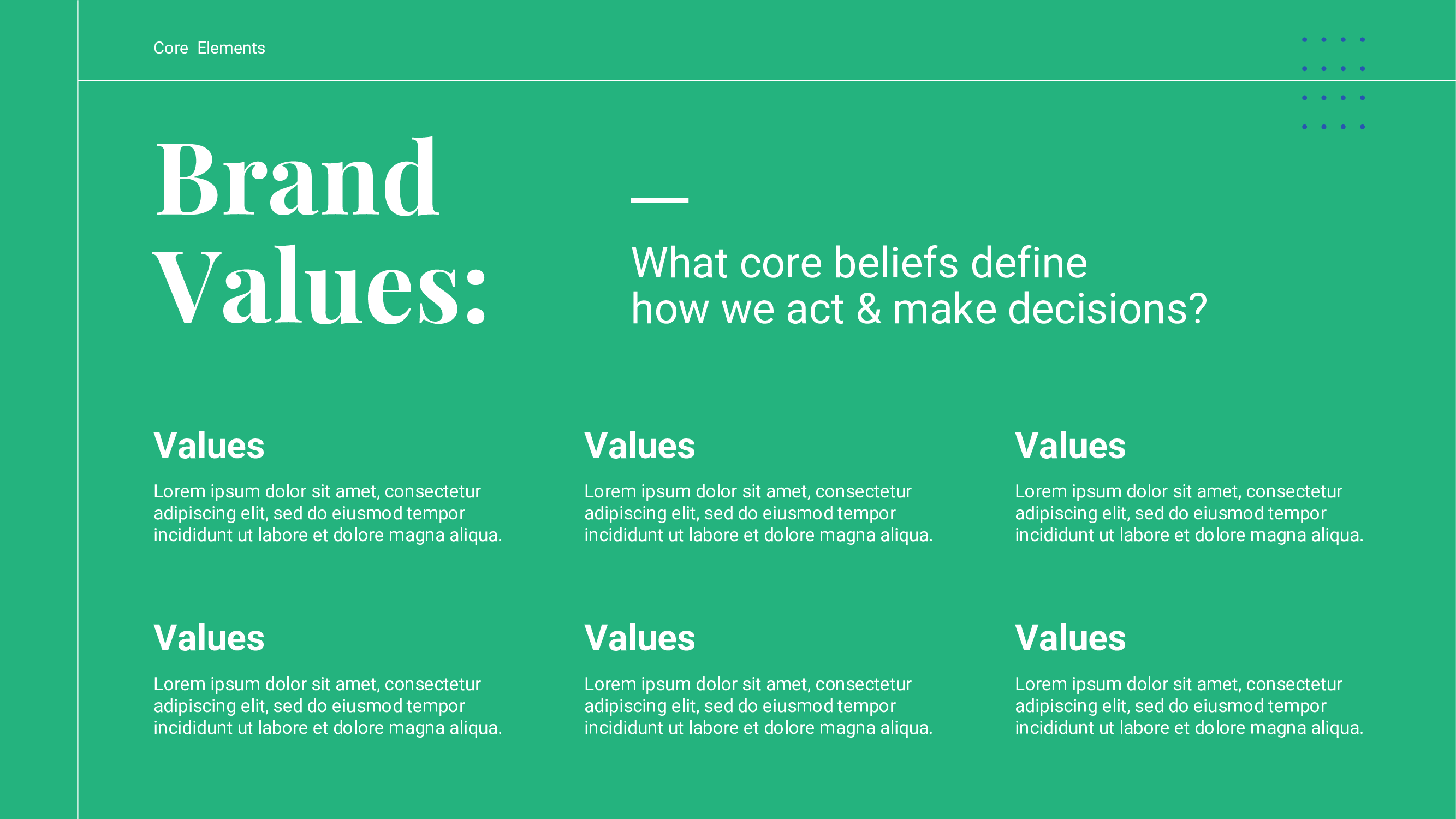
3. Brand Values
Including your brand’s values in your presentation is important as it helps match your team's actions and decisions with the core principles your brand stands for.
You can present them simply or provide explanations for each one:
4. Brand Voice & Tone
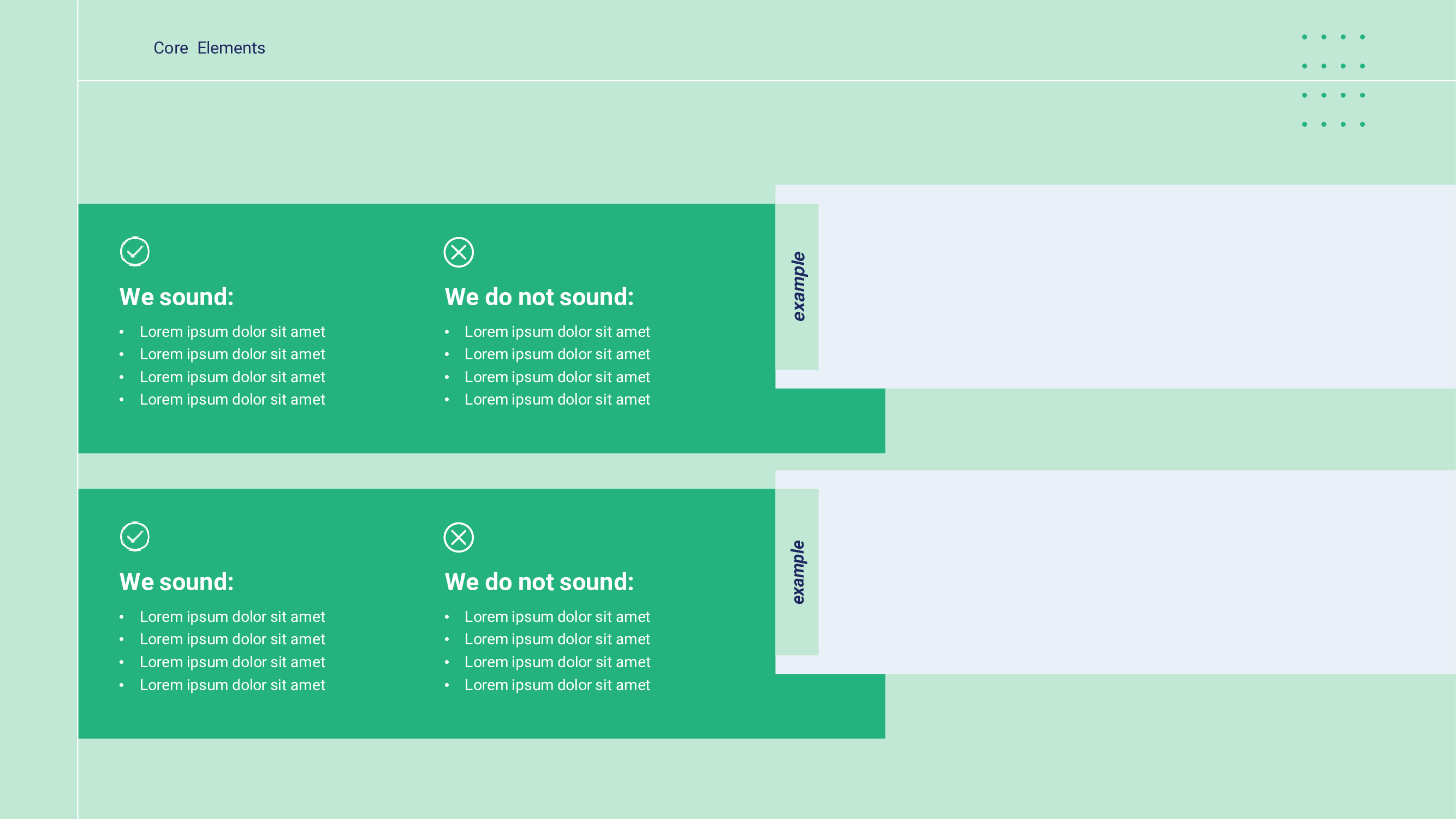
Explaining your brand's preferred tone of voice is essential because it sets the writing style for all your content.
Be sure to provide a description of how your brand should communicate and share examples about what to do and what not to do in order to clarify expectations:
5. Buyer Persona
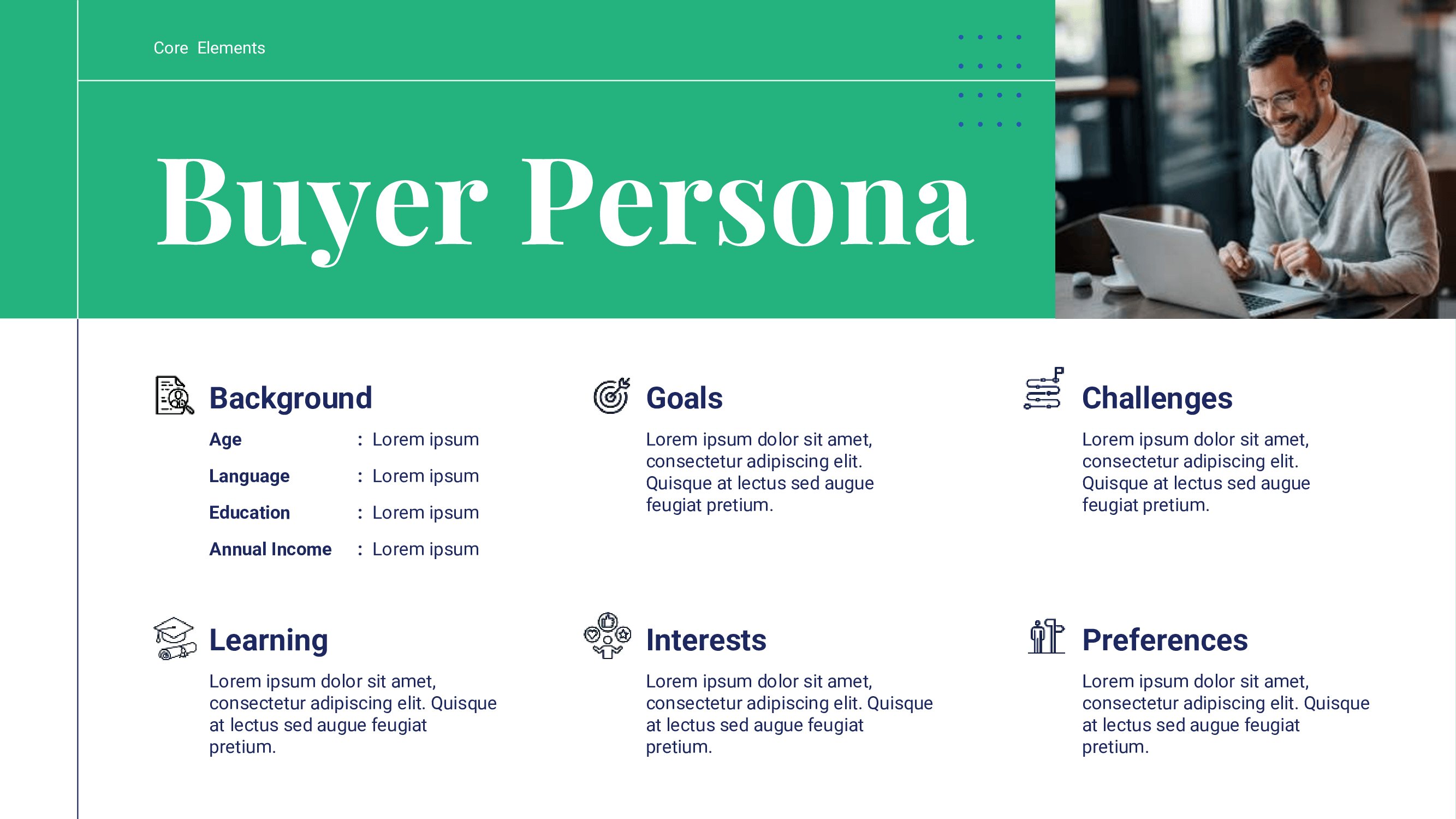
By presenting your buyer persona, you ensure that every stakeholder understands who the brand is speaking to.
This way, you can create content that resonates with your target audience. Here is our buyer persona’ slide:
Brand Identity Presentation: Visual Identity Elements
Now, let’s check out the visual elements you should definitely include in your brand identity presentation:
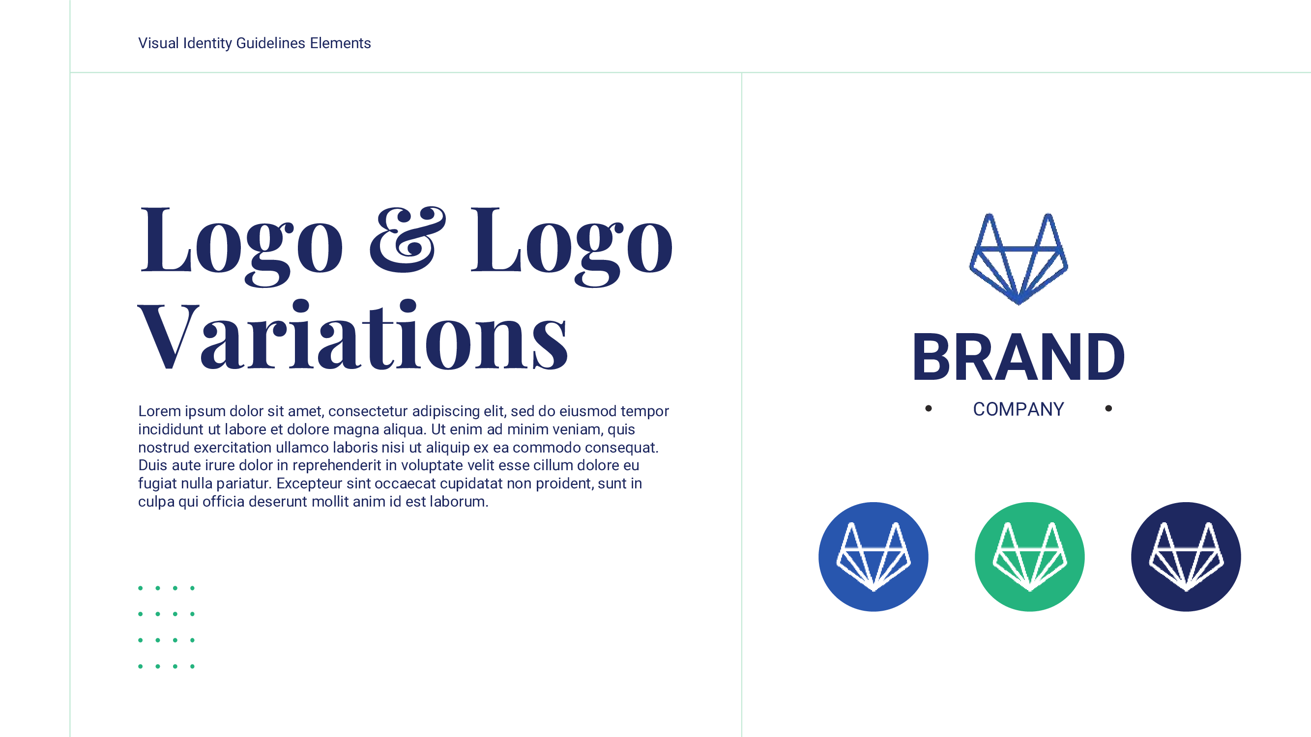
6. Logo & Logo Variations
Your logo is a cornerstone of your brand identity. Including it, along with variations and do’s and don'ts, ensures that everyone has access to and uses it correctly, which helps maintain a professional and consistent brand image.
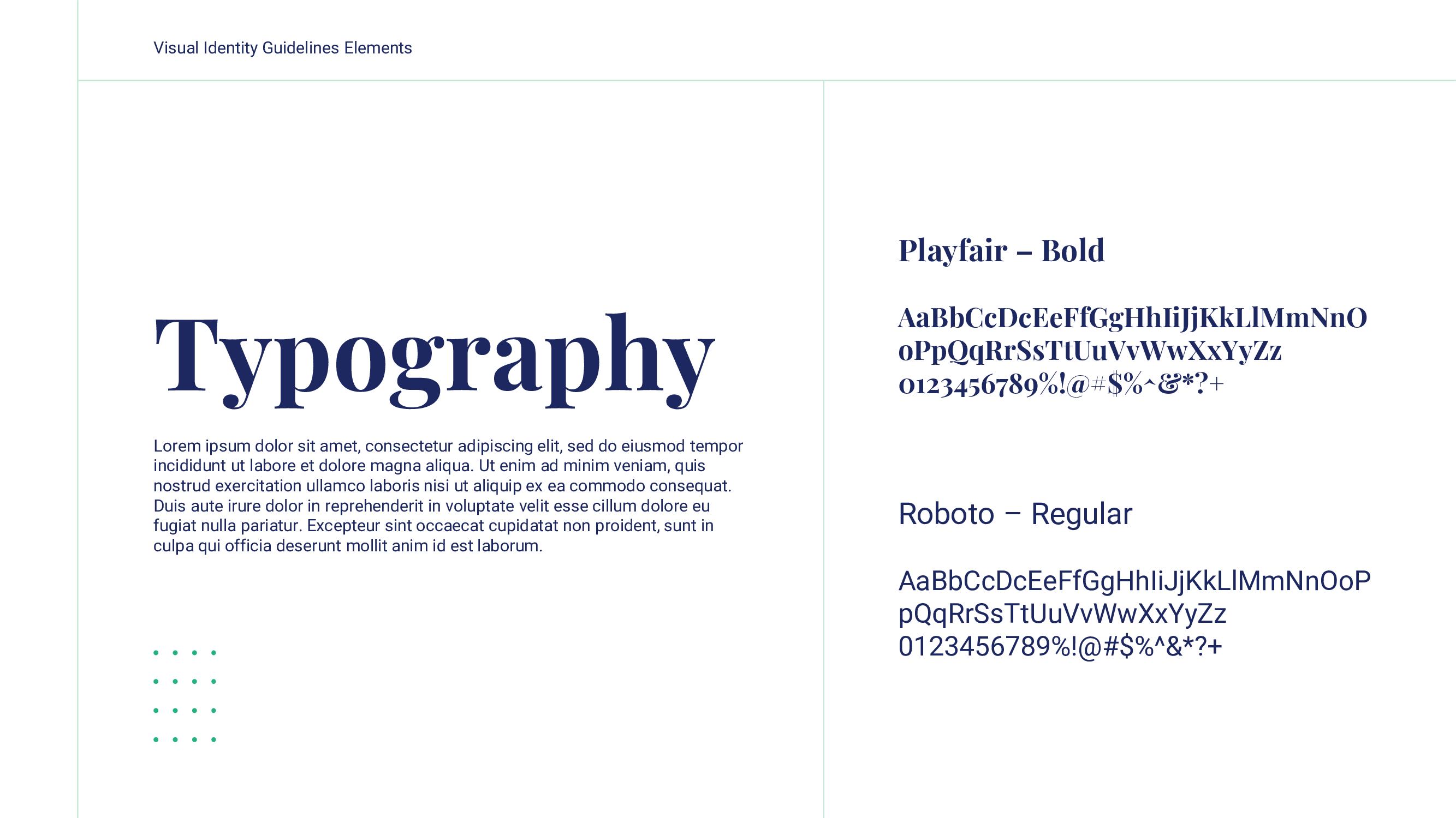
7. Typography
Presenting your chosen typography is essential for maintaining a uniform visual identity in your text-based content.
Include font styles for different types of text and usage guidelines to ensure that all written materials adhere to your brand’s style.
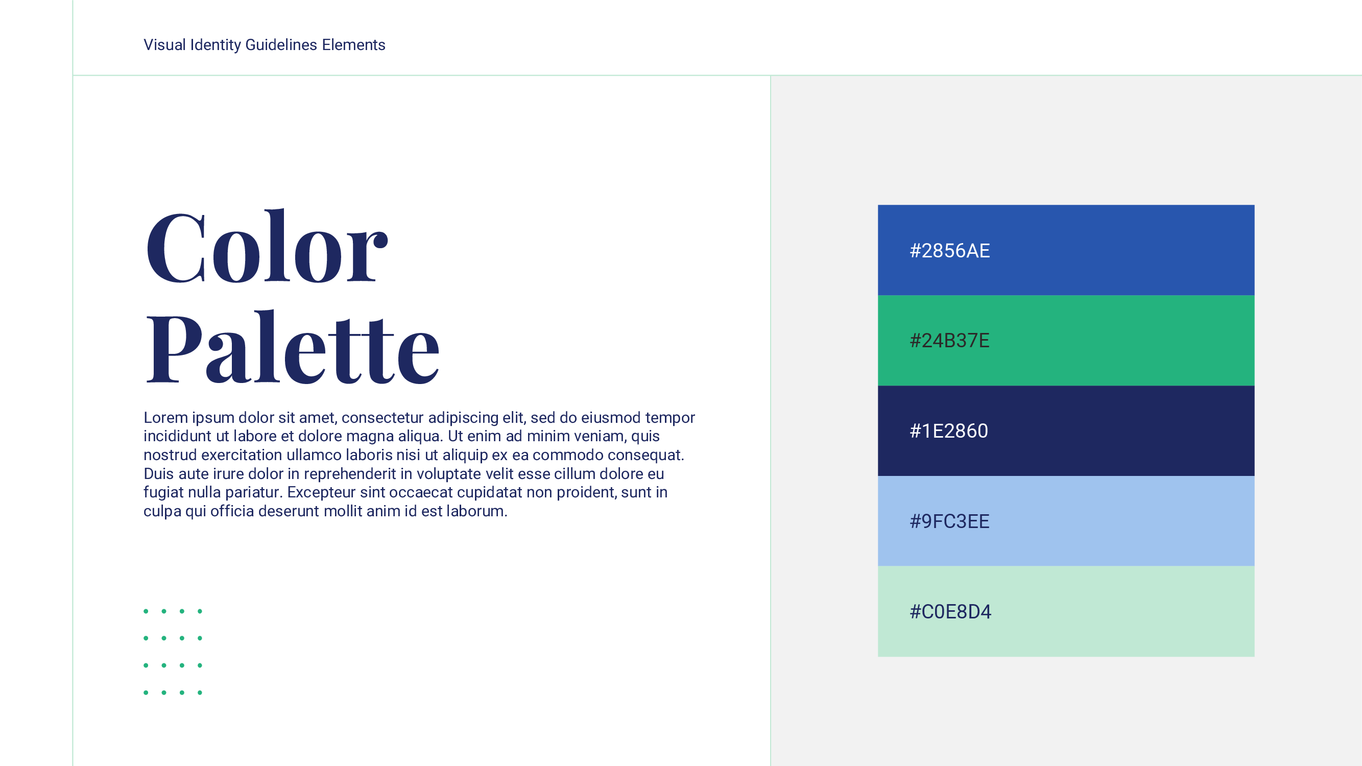
8. Color Palette
Displaying your primary brand colors and their codes is essential for consistent visual branding.
By providing the color palette and codes, you ensure that all design elements align with your brand's color scheme.
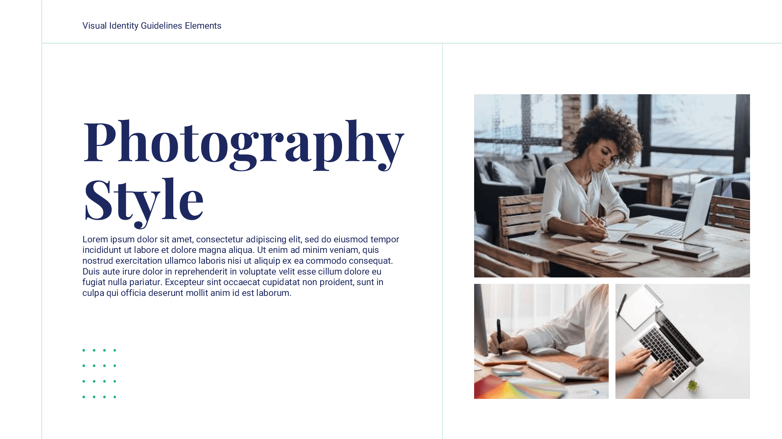
9. Photography
Explaining the style and types of photography that align with your brand is crucial.
Make sure to include examples of preferred photography styles that help your team understand the visual aesthetic your brand aims to achieve.
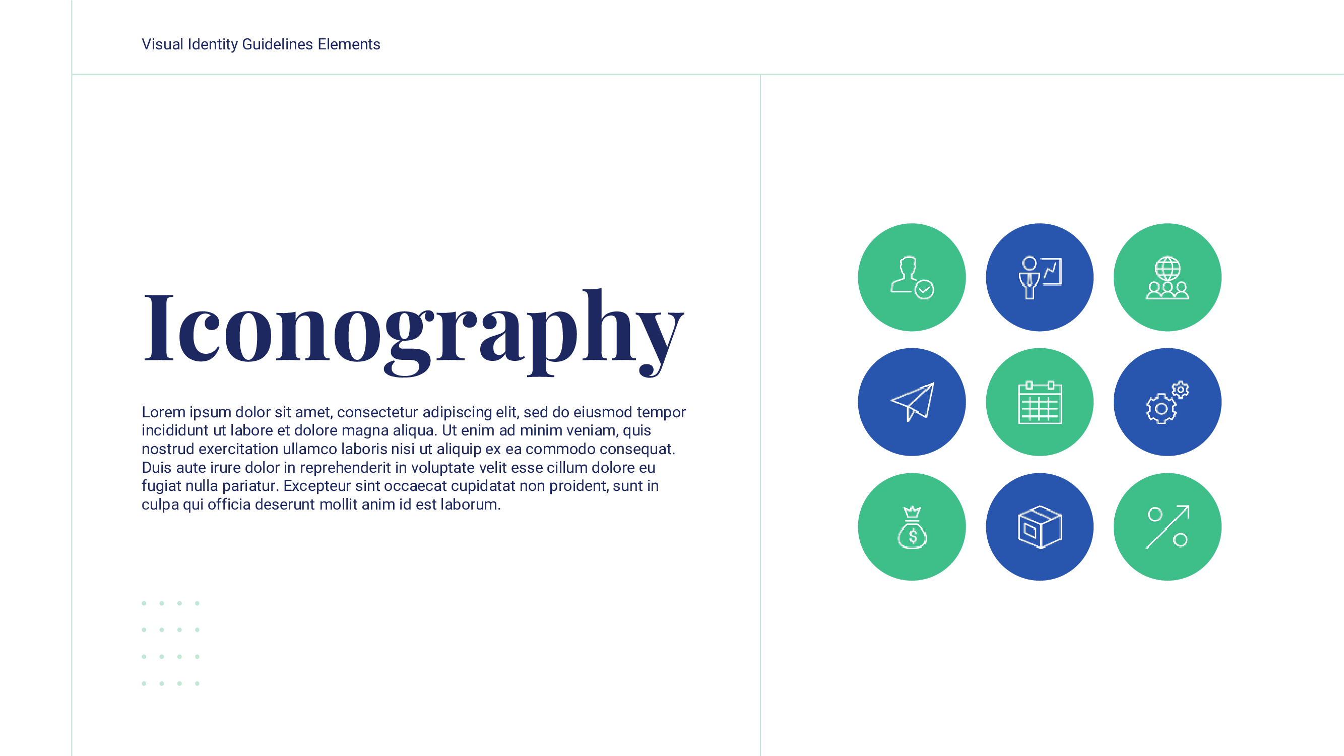
10. Iconography
Icons and illustrations have become widely used visual resources in recent years. Including guidelines for these elements is essential to ensure visual consistency across all your brand's materials.
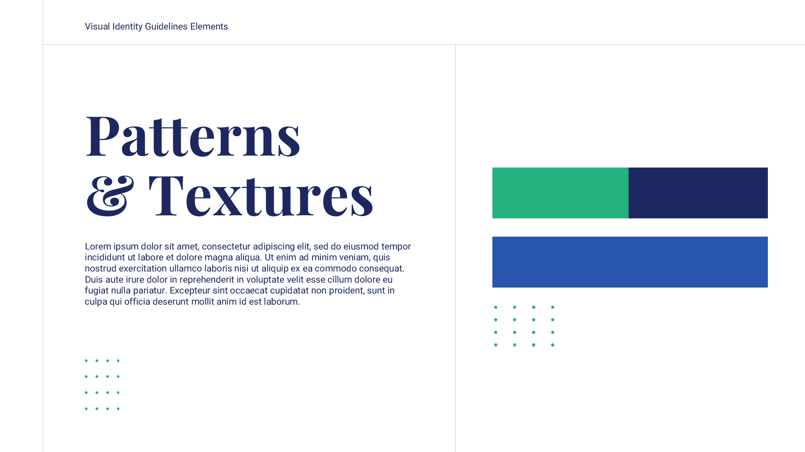
11. Pattern & Textures
Patterns and textures add depth and uniqueness to your brand identity. Define their usage to ensure they complement your overall branding.
We recommend providing examples of how these elements can be applied in backgrounds, packaging, or other materials without overwhelming the design.
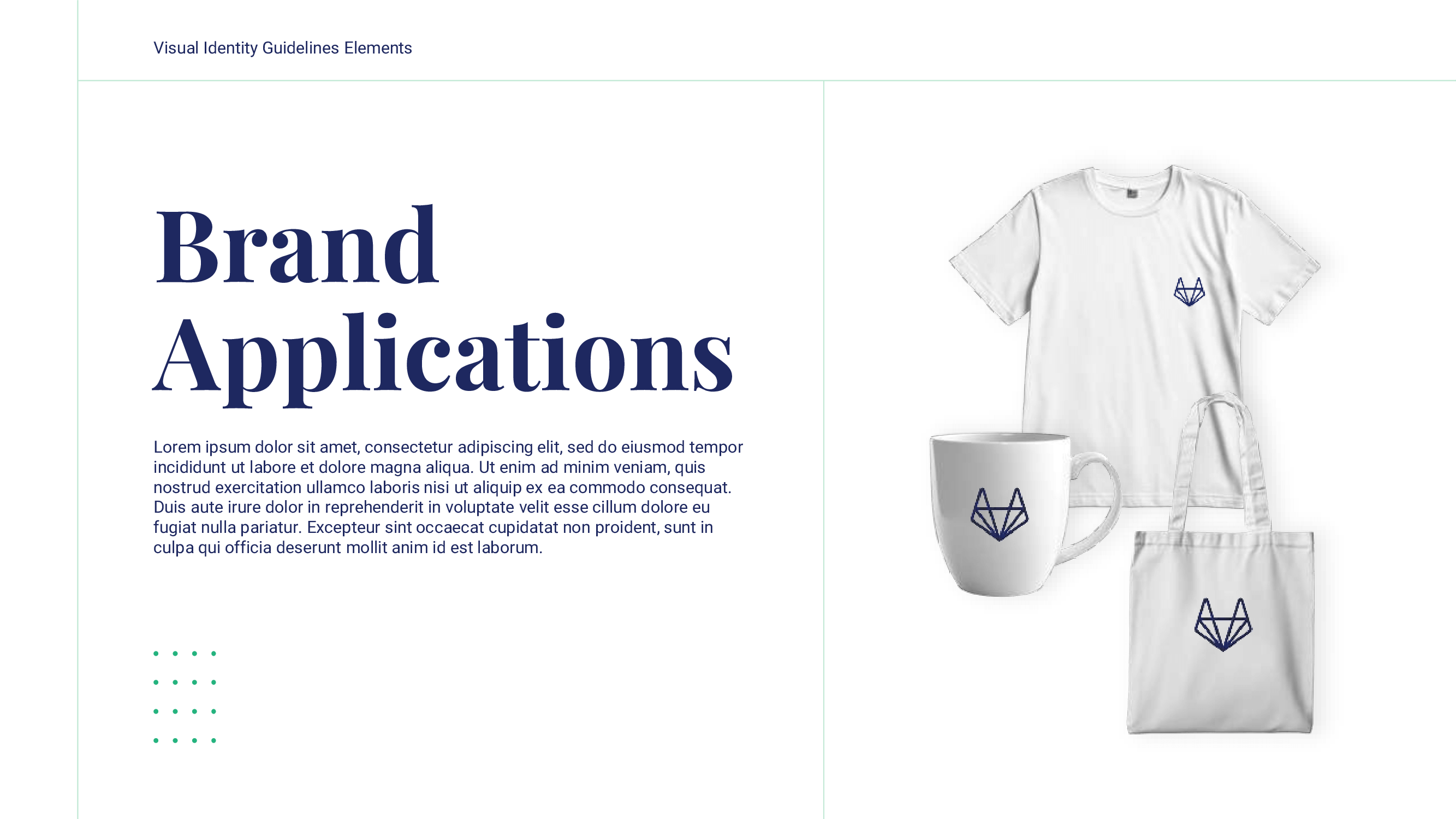
12. Brand Applications
A brand book can’t be complete with a sample of your brand applications.
Highlight examples of approved designs for products like t-shirts, mugs, and packaging, ensuring that your brand’s colors, logo, and visual elements are consistently applied.
13. Contact
End your brand identity presentation with a contact slide.
This slide should include the key people or teams to contact for questions, approvals, or further support regarding the brand guidelines.

Brand Identity Presentation: Additional Recommendations
Be sure to consider these supplementary recommendations to elevate the quality of your brand book:
First, Ramaditya recommend us to:
“Make sure to include a link to access existing branding assets, so it’s easier and faster for designers to use them.”
Including links to all the assets is a great way to facilitate the process of everyone designing or creating content. Attach these links for your logos, illustrations, shapes, etc.
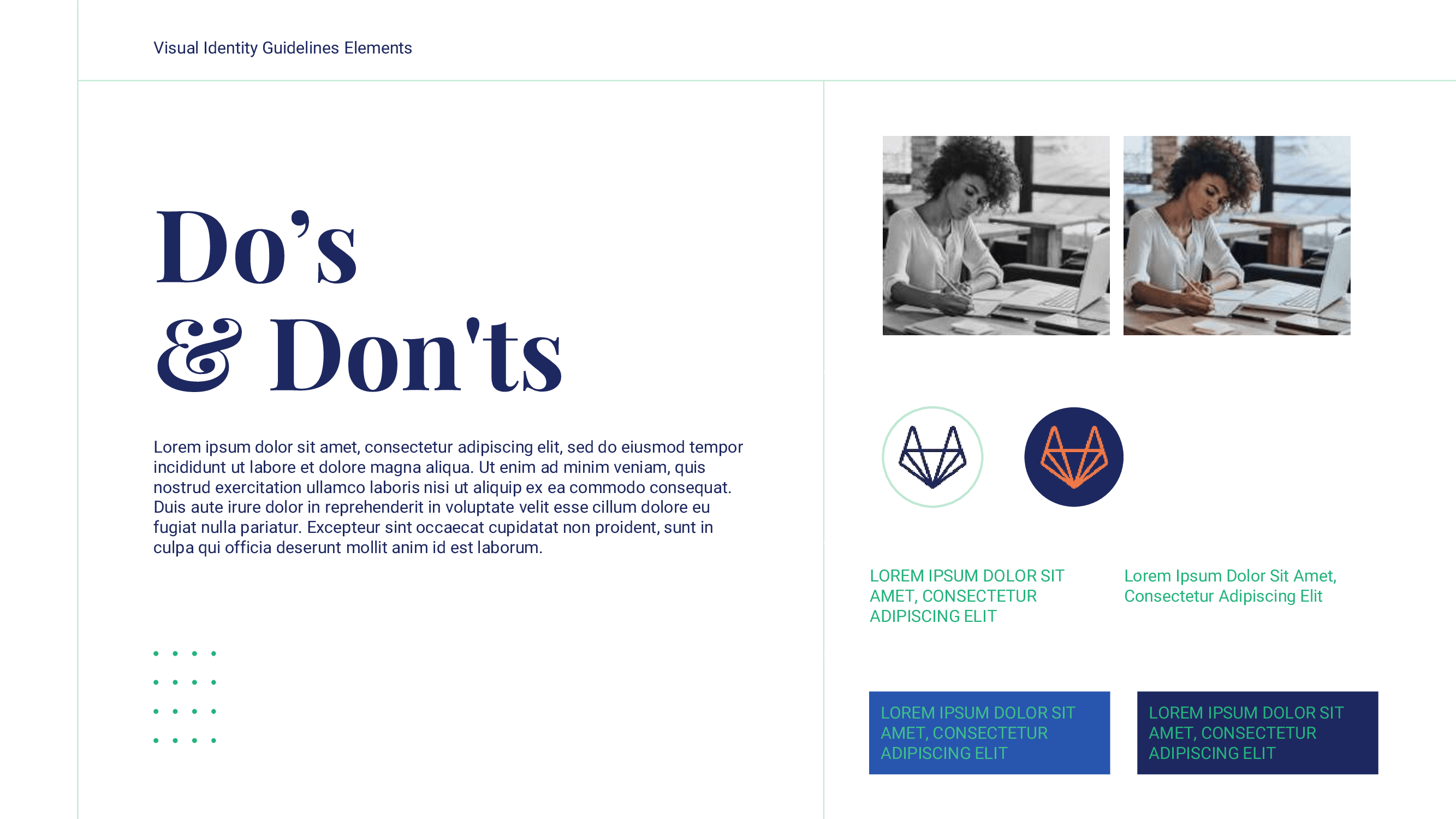
Additionally, remember that you should include as many examples as possible. Try to be as specific as you can to ensure that all your content is illustrated exactly as you have in mind. As Indah adds:
"Be specific about how you would like to visualize your brand. Provide context regarding how the elements should be used and include the Do's and Don'ts. Offer examples of both correct and incorrect applications of brand guidelines to help minimize errors in their implementation."
Brand Identity Presentation Examples
Ready to see the final product? Check out some amazing brand identity presentation examples.
Skype
Skype provides a great example of everything you must include in your presentation, especially how to present it. Skype’s guide offers a visually appealing yet playful presentation that cleverly introduces all of the brand’s elements in carefully crafted storytelling.
See the full brand guide here.

Heineken
Heineken’s brand identity presentation provides every detail you should include in your own presentation. They consider every single element, from all the logo variations, to all the visual elements the content creators or designers could need.
Check out the full brand guide here.

Download Our Brand Identity Presentation Template for FREE!
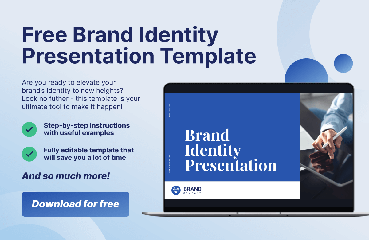
In order to make the process easier, our 24Slides team has designed a PowerPoint template based on the structure we have seen before. This free resource is an excellent starting point for building your company’s brand identity presentation!
This practical template includes 20 customizable slides to showcase your brand elements. Ready to begin? Download our PPT template for free!
Want your Brand Identity Presentation in PDF?
If you’re using our free PPT template, you can easily save the final result as a PDF. Just follow these steps:
- Double-check that every detail in your PPT is in place.
- Go to the “File” tab and click “Save As.”
- In the file type dropdown, select PDF (*.pdf).
- Choose the folder where you want to save it and click “Save.”
Elevate Your Brand Guidelines with Our Expert Presentation Designers
How are you going to encourage people to use your brand properly if you don’t do it yourself? Branding your guidelines or any of your presentations is key!
Your brand style guide or brand identity presentation is an excellent opportunity to practice what you preach and show how a document can breathe and live your brand to the fullest.
Ideally, your brand manual will be a consultation document for internal and external teams (graphic designers, copywriters, web developers, marketers, consultants, etc.), so it makes sense to have it aligned with your brand as well.
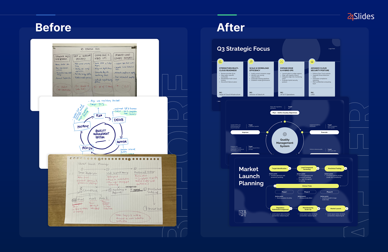
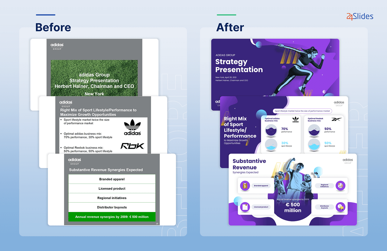
At 24Slides, our PowerPoint designers are experts at making presentations that truly reflect your brand and values. Just check some of our before-and-after examples:
If you want to test the service first, that’s totally okay! We’re all about transparency and 100% customer satisfaction, so here’s a try-out offer for you: send us one slide (maybe the cover of your brand style guide!), and we’ll redesign it for just one dollar.
Our designers have provided top-notch presentations to thousands of professionals and companies worldwide, so rest assured that your slides are in good hands.

If you like this content, you should check:


