How To Create The Best PowerPoint Presentation Background
There’s no getting around this – your PowerPoint presentation background matters. A lot of factors go into what makes a particular design stand out, but one of the most overlooked factors is PPT slide background design.
PowerPoint’s default background color is white. If you’re in a hurry and you need to put a presentation up fast, then white will normally suffice. But, if you want to impress your audience, you have to think outside the box.
If you’re interested to know how your PowerPoint presentation background can impact your overall presentation, then you need to read this entire article. It will only take up a few minutes of your time, but by the end of this article you’ll know the importance of using a great PowerPoint slide background!

4 Reasons Why Your PowerPoint Slide Background Design Matters
Humans are visual creatures. We have the gift of sight that allows us to appreciate the infinite variations and combinations of color, texture, style, and design all around us.
Our eyes are automatically drawn to beautiful imagery. Our eyes linger on colorful and beautiful scenes on photos, videos, canvases, and many other different places, including PowerPoint slides.
Think about it – will you pay more attention to an outdated and lousy-looking slideshow or a well-designed one? I bet you’d pick the latter. Your eyes just automatically gravitate to the attractive-looking slideshow.
Without further ado, here are five of the biggest reasons why your PPT slide background design matters:
1. The best PowerPoint presentation background makes your slide elements come alive
To make the most of your PowerPoint slide design, you can use a combination of many different kinds of elements. You can insert text, images, icons, vector images, video, audio, shapes, charts, graphs, tables, and diagrams.
Take note, however, that just because you can insert many different kinds of elements into your slide doesn’t mean you should use these all at once, in a single slide! That would be chaos, pure and simple.
For maximum audience impact, you’d want to use a few elements only on each slide. Make sure there’s plenty of white space, and don’t forget to use a good combination of colors that actually complement, not clash, with each other.
Here’s a sample slide which uses plenty of white space, good typography, excellent color combination, and a nice background that is related to the presentation’s subject (football).

Just by looking at the background (the striped green football field), football fans will immediately recognize what the subject is all about. Since the subject is football, the dark colors in the background’s edges further help to emphasize the masculinity of this sport.
Now imagine if this slide had a plain light or dark-colored background. It probably won’t have the same effect as the current background does.
2. The best PPT slides use backgrounds that add texture to the presentation
One of the least thought about aspects of presentation design is the PowerPoint backdrop. Think about all the PowerPoint presentations you’ve done in your life. Did you bother changing the background in any of those presentations? Or were you happy with the default white background?
Now, please don’t get me wrong. There’s absolutely nothing wrong with using a white background. However, if you’ve got the time to spare, don’t settle for the default white when you know your slides can look much better with a different background.
To create truly beautiful PowerPoint slides, you’d need to think about adding some texture to your background. It’s easier to add or create texture when you’re physically holding something. When designing PowerPoint slides, it’s a different story. You’re basically creating a physical illusion for your audience.
For instance, if you use a background image of an expensive and plush looking carpet in your slides, then it’s easier for your audience to imagine the feel of that carpet.
If you want to create the illusion of wetness, then you can use an image of raindrops on a glass window, or the surface of a wet umbrella, or something of that nature. Take a look at this image below:

Wouldn’t you say that when you looked at the image, you ‘felt’ the rain touching your skin? If you used this image as a background on slides that talk about something that’s related to rain or the weather in general, then your audience will find your slides much more relevant and interesting.
Or how about this slide?
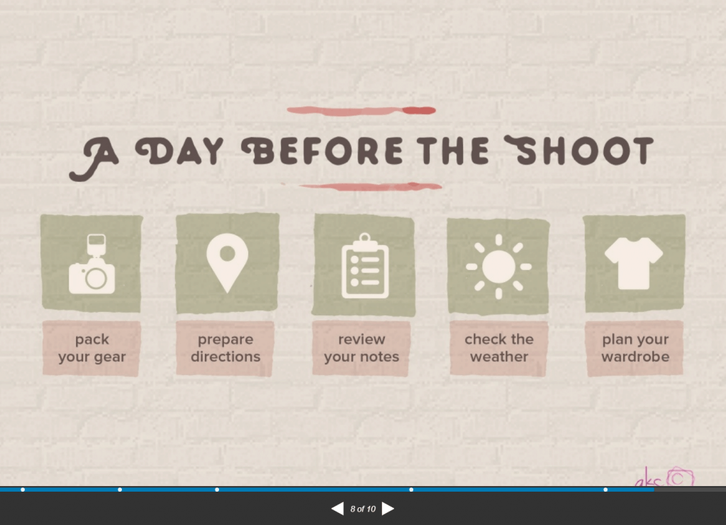
There’s a pale pink overlay on top of the brick wall in the slide’s background. I think the background adds a nice texture to the slide, and you can also see how all the elements (fonts, icons, colors) complement and match each other.

3. A good PowerPoint slide background makes your slide look so much more interesting
Imagine if you had to sit through an hour-long PowerPoint presentation and all the slides had nothing but a plain white background on it. No variety, no design, no background. Just that awful default background for an entire hour.
Let’s say this is slide #1 out of 50, and all the slides had the same background:

You’d probably feel physically sick after the first 5 minutes knowing you have another 55 minutes worth of slides to sit through!
If you were the presenter, would you subject your audience to such horror? I sure hope not!
Now, what if you used a different color every 2 or 3 slides? Would that make your presentation appear better? Maybe. Maybe not. But it would sure add some variety to your presentation.
Going back to our example, what if you added a nice background image to slide #1 and it looked something like this?

I think you’ll agree with me when I say this looks much better than the one with the plain white background. The best thing is it will only take you a minute or two to find a good image, and set it as your slide’s background!
Nowadays, with multiple sources of design inspiration which you can easily Google online, poor design skills can get you in real trouble.
Your audience can easily take a video of your disastrous presentation and upload it to social media where you will forever be branded as the world’s worst PowerPoint designer (this is an exaggeration of course, but with today’s Internet, anything’s possible!).
You don’t even need design skills to make cool PowerPoint designs. Simply look for inspiration on graphic design websites and then have the initiative to come up with your own design.
The best PowerPoint slides all follow the best practices in graphic design – and that includes using good presentation backgrounds.
4. A nice background for PowerPoint helps lead your audience’s eyes to your subject
When creating PowerPoint presentations, it’s important to pay attention to your content, or the message you want to convey to your audience. It’s also a must that you think about how you’re going to present your points in a clear and succinct manner. You don’t want your audience to tune you out while you deliver your presentation!
One way to tie all these elements together – your message and your audience’s attention – is by leading your audience’s eyes to your subject with the help of a nice background for PowerPoint.
There’s a lot of factors that come into play to lead your audience’s eyes to your subject. You’ll have to consider first what your slide’s main subject is and then look for a suitable background image or create one from scratch. You can use your background’s colors, compositions, shapes, etc. to catch your audience’s attention.
Also, don’t forget that the background should be just that – a background. It’s not meant to superimpose on the foreground. Rather, it’s supposed to enhance the foreground or the subject in your slide.
Remember this point when you get confused about choosing the best background for your PowerPoint presentation. If you’ve got a very colorful image as your background, you can add a color overlay to mute the colors, while still making sure it’s visible.
Don’t worry if you don’t know anything about overlays. I’ll show you how to use overlays later in this article.
Frequently Asked Questions About PowerPoint Presentation Backgrounds
Now that you know why a good PowerPoint presentation background is necessary for your presentation to be a smashing success, it’s time to answer a few of the most commonly asked questions about presentation backgrounds.
Question #1. How to add a background in PowerPoint?
Adding a custom background in PowerPoint is a fairly simple process. There are two ways to go about adding a background to your slides:
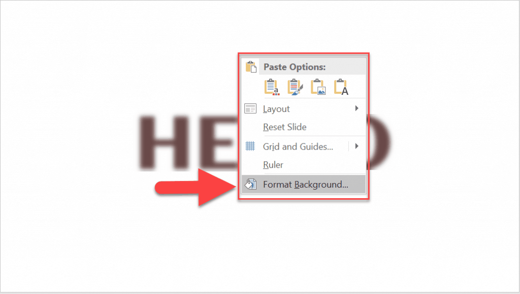
- Method 1 – the right-click option. To access this option, click on the slide you want to format the background on. Then right-click on the slide itself. The Format Background option will be the last option (see screenshot):
- Method 2 – the Design tab option. To access this option, go to the Design tab on the ribbon. On the far right side, you will see the Format Background option. Clicking it will open the Format Background pane on the right side of your screen.

The format background PowerPoint options allow you to choose from a number of different elements which you can use as background. Scroll down to Question #3 for more details on the different background options you can use in PowerPoint.
Question #2. How to change the background in PowerPoint?
Changing your PowerPoint custom background works pretty much like adding a background. You can change your background anytime by accessing the Format Background menu options. From there you can change to solid fill, gradient fill, picture or texture fill, and pattern fill.
If you’re using video as your slide background, you will need to delete the video first, and then access the Format Background options to change the background.
Question #3. What are the different types of elements you can use as background in PowerPoint?
There are 4 main elements you can use as a PowerPoint background: color, pattern, image, and video. I’ll describe each element in more detail below:
Color Background
When using color as your background, you can choose to use either a solid or gradient color. Solid is simply using a single color as the background for your whole slide. Gradient, on the other hand, is using a combination of different colors to create a gradual blend or mix of colors.
Here’s how you use a color background on PowerPoint:
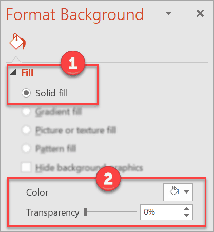
- Right-click on the slide and choose Format Background. The Format Background pane will appear on the screen.
- In the Fill section, select Solid Fill (see box 1). The settings for this option are right below (see box 2). You can choose your color and the transparency level.
- If you want to use a Gradient fill, then see the next screenshot:
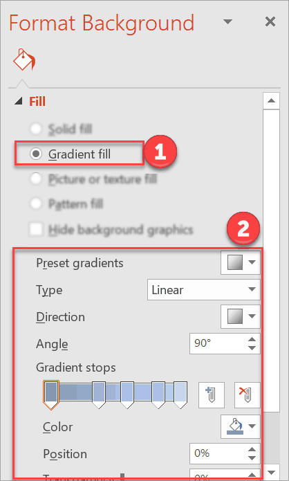
As you can see, you have more options with Gradient Fill. In addition to choosing the ‘base’ colors for the Gradient Stops, you can choose the gradient type, the direction and angle of the gradient, the position, transparency, and brightness. You’re also free to add or delete any of the preset gradient stops.
Pattern Background
Pattern backgrounds add texture to your slides. In PowerPoint, there are many different patterns to choose from. You can even play around with the foreground and background colors you want to use for each pattern.
Here’s how you use a pattern background in PowerPoint:
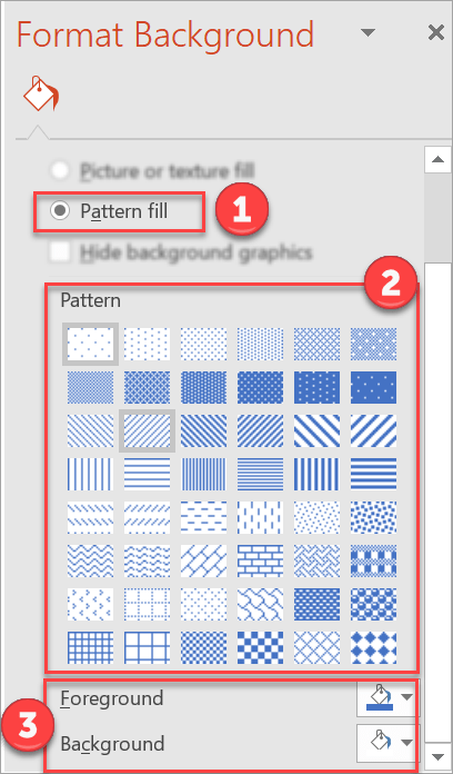
After choosing Pattern Fill, select the pattern you want to use. Once you’ve chosen your desired pattern, choose the foreground and background colors. That’s it!
Image Background
You can make cool PowerPoint designs just by selecting an awesome image as your presentation slide’s background. Of course, a professional presentation background means using strictly subject-relevant images.
Just because you like an image doesn’t mean it’s a good fit for your presentation. Remember to consider who your audience is when choosing images.
Using ‘offensive’ background images can dock points off your presentation, leaving you with an unhappy audience.
So, here’s how you use an image as a background in PowerPoint:
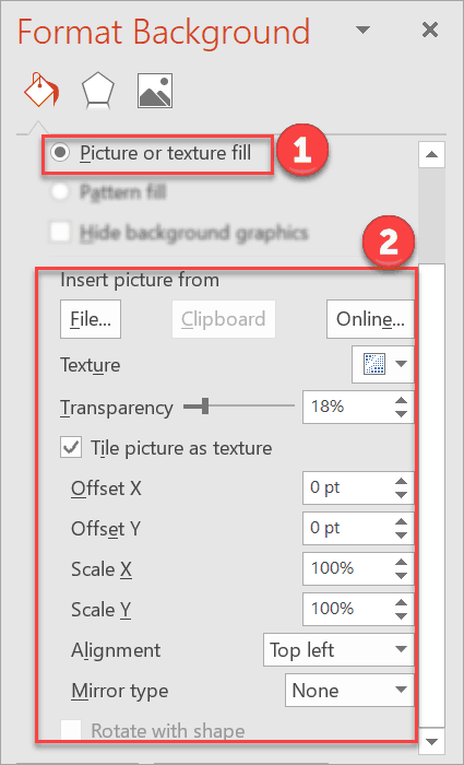
There’s quite a number of options when setting an image as background. You can choose to use a file from your computer, clipboard, or online. You can set the transparency, the position, etc.
Play around with the different settings until you find the most suitable appearance for your background image.
Video Background
Using video as a background may seem like an advanced technique that can’t be done on PowerPoint, but trust me it’s really quite simple to do this.
Video backgrounds look nice on its own so you’d have to be really careful not to make your slide look messy and chaotic.
For best results, it’s best to use simple text or shapes on top of your video. But then again, the final output will depend on what your presentation aims to achieve.
Here’s how you use video as background in PowerPoint:
- Go to Insert > Video. You can use a video from your PC or from an online source. Note that if you’re going to be using an online video, you’d need to have to access to it when you play your presentation. Otherwise, your video background won’t work. See screenshot below.
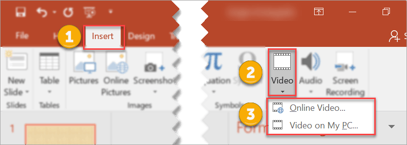
- Once you’ve chosen your video, you can resize it to fit the slide or you can reposition it to show only a particular section in the video. To do the latter, you can unlock the aspect ratio in the Format Video settings (click on the video to access the Format Video pane).
- If you want to insert some text or shapes on top of the video, go to the Insert tab and select the element you want to insert.
- To make sure your video stays in the background, click on the video. The Video Tools tab will then appear on the ribbon. Click on Format and hit Send Backward.

For royalty-free videos, you can visit any of these sites: Pixabay, Videvo, Videezy, and Pexels.
Question #4. What is the best PowerPoint background size?
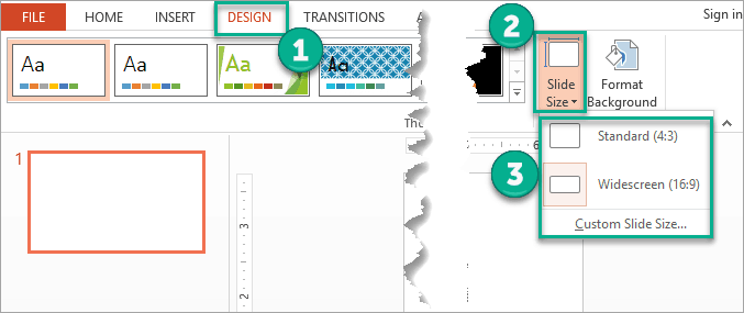
Your PowerPoint background size will be the same size as your PowerPoint slide. So, whether you’re using standard (4:3 aspect ratio), widescreen (16:9 aspect ratio) or custom slide sizes, your background size will be exactly the same size as well.
For instance, if you’re using a 16:9 image as your background, and your slides are standard 4:3, PowerPoint will resize your image to fit the 4:3 slide.
If you’re not sure what your slide sizes are, you can go to Design > Slide Size as you can see in the image below:
Question #5: How to create the best background for PowerPoint presentation
The most creative PowerPoint slides and the best designer slides have something in common – awesome backgrounds! Of course, backgrounds are just one element in the whole presentation. But with a combination of the right background and foreground elements, the chances of visually delighting your audience are much higher.
Creating the best background for PowerPoint is a subjective endeavor. What may fall in your ‘best’ category may be mediocre for someone else. Likewise, what may look lacking to you may be impressive to another person. At the end of the day, however, you’re presenting in front of an audience, so it’s their opinion that really matters the most.
Think about your presentation topic and who your target audience is. Then work on your presentation slides with your audience in mind. There are plenty of PowerPoint presentation design tips on the Internet and you’ll find many slide design ideas to inspire you.
8 Highly Actionable Tips To Help You Make Cool PowerPoint Presentation Backgrounds
Here are a few PowerPoint slide background ideas to help get your creative juices flowing:
1. Add Shape and Color Overlays to Background Image
When using image backgrounds, you can add a shape overlay to make the background even more interesting or to make the foreground look sharper.
To do this, go to Insert > Shapes.
For this method, I’d normally select a rectangle shape and cover the entire slide. Click on the shape itself so that the Format Shape pane will appear on the screen. I personally find that adding a gradient fill makes the background look better.
Here’s a before and after picture:


You can see just how much better the second image looks after I added an overlay. The word HELLO stands out and provides a nice contrast to the dark background. It’s really a simple trick that you can do in just a few minutes.
2. Use Trendy Geometric Polygon Backgrounds
Geometric polygon backgrounds look great on PowerPoint especially if you pair it with the right kind of font and the right graphics. It also adds texture to your slides and makes your slide look colorful and interesting.
To use geometric backgrounds, you can either download from any royalty-free photo sites, or generate your own. If you want a unique background for your slides, you can visit Trianglify Background Generator.
Here’s what it looks like:

To use this nifty free online tool, simply choose the settings for your background. In the Render Options section, you can specify the Width, Height, Cell Size, Cell Padding, and Bleed. For the color scheme, you can choose from the Palette List.
When you’re happy with how your geometric polygon image looks like, download it and then save it to your computer. You can then use the image as your PowerPoint slide background. You will be able to edit it using the Format Background options.
3. Use Artistic Effects in Format Background Pane
The Format Background menu in PowerPoint gives you plenty of options to customize your background according to your design preferences. For even better control, you can use Artistic Effects to make your background look better.
To access Artistic Effects, click on the background image to open the Format Background menu. Click on the second, pentagon-shaped icon.
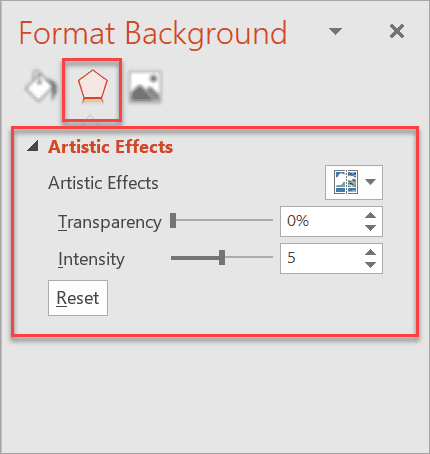
You can choose from different artistic effects by clicking on the drop-down menu. You can also change the transparency and the intensity of your chosen effect.
Hover your mouse pointer over the different artistic effects to know what each effect is called. Here’s an example:
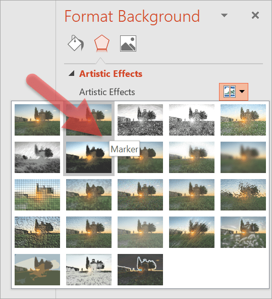
Clicking on an effect will lead to individual effect settings. Play around with the options until you find the best background for your slide.
Here’s what my slide background looks like when I chose the Blur effect and set the radius to 54%.

4. Mix up the background colors
You can use a two or three-color theme for your entire presentation. You can use any combination of colors, however, for best results, you may want to check out Adobe’s Color Wheel website.
Feel free to experiment and play around with the settings to find the best color combination for your slide backgrounds. Or you can explore other people’s color themes to give you a head start. It’s a free service, so check it out if you want to use different color combinations.
Another option would be to combine different gradient colors for your background. If you want ideas, you can visit UIGradients and use the suggested combinations to produce great background color gradients for your PowerPoint presentation!
For simplicity’s sake, however, black and white makes a great combo. For example, you can choose to use a black background for your title slides, and then use white for your content slides, or vice versa. Sometimes, there’s no need to complicate things, and simple does the job just fine.
Alternatively, you can also use a different background color for each theme or idea. For example, if you’ve got a presentation on cars, then you can use a red background color for cars made in the 1990s, a blue background for those made in the 2000s, and so on.
Mixing different background colors and/or overlays will definitely help spice up your presentation and avoid boring your audience to sleep.
5. Use Your Company Colors In Your Presentation Background
If your company uses a set of colors for branding purposes, make sure you put it to good use. Using company colors will help your brand especially if your company uses a specific color palette not commonly used in your industry. This not only helps you save time on looking for appropriate colors, but you also get to help your company build your brand.
Also, you don’t necessarily have to put your company’s logo front and center in in all your slide’s backgrounds. A small logo in a slide corner will normally suffice in most company presentations so as not to distract from the presentation at hand.
If your company spends a huge amount of money on advertising and branding activities, then do your part and use your company’s colors and logo in your PowerPoint presentation.
6. Try Using White Fonts Over Images
I’m sure you’ve seen memes or photo quotes on social media with white text overlaid on an image. You’ve probably seen quotes like this on your social media timeline or news feed:

Now, this technique may not be appropriate in some presentations, especially for business-oriented presentations. However, if you’re presenting to a group of people who appreciates quotations and loves memes, then try to surprise them by using a few quotation slides in between your main content slides!
7. Use a Consistent Background Image for Related Topics
If your presentation consists of dozens of slides, you may need to spend plenty of time looking for a unique background image for each slide. To save time, you can use one background for related topics or themes in your presentation.
For example, you can use one background image for your introductory slides, another background image for your company background and history slides, another background image for your timeline and SWOT analysis slides, etc.
To spice things up, you can always add a colored overlay to make each slide background look different from each other.
8. Use Patterns and Textures in Your Background
You can use a combination of image, graphics, patterns, and textures in your presentation slide’s background. Take a look at this example where the main content is divided into two columns – the text description on the left and the supporting image on the right. Wouldn’t you say your eyes quickly settled on the image on the right?

Final Words
A lot of work goes into creative PowerPoint slides. Oftentimes, it’s the main content or the subject that gets the bulk of a PowerPoint designer’s attention. As you’ve learned in this article, however, slide backgrounds play an important, if underrated, role too. Apply the techniques I’ve shared with you to create beautiful PowerPoint slides that will captivate your audience for the entire duration of your presentation!


